Character & Mascot · Branding · Packaging
A mascot for a handmade house.
A whole illustrated brand world for a family house of handmade puja & décor — giving a humble, deeply traditional craft a warm, contemporary face.
The brand
Shouryakriti is a family-run house that makes puja and décor objects by hand — crafted from cow dung and traditional folk techniques. It's a beautiful, deeply rooted craft, but a hard one to present to a modern audience: the raw material reads as humble, and the category is crowded with generic, devotional-stock visuals.
The brand needed a face that felt sacred and homemade and contemporary enough to sit on a shelf — or a feed — beside premium lifestyle brands.
Meet Kriti
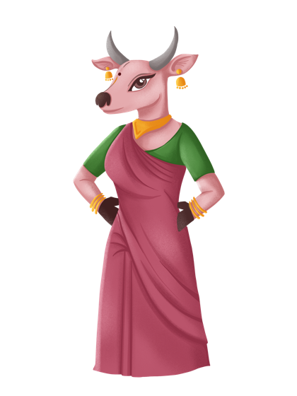
The answer was a character. Kriti is the brand's cow mascot — fitting, given the craft — drawn as a warm matriarch in a saree, with bells, bangles and a bindi. She turns an awkward conversation (objects made from cow dung) into an affectionate, unmistakable one.
She is the brand: every touchpoint can be carried by her presence rather than by explaining the material.
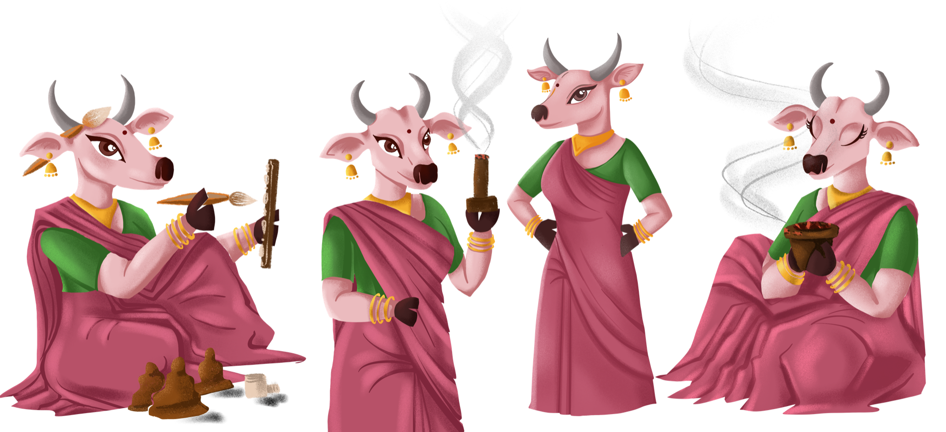
A character who does the work
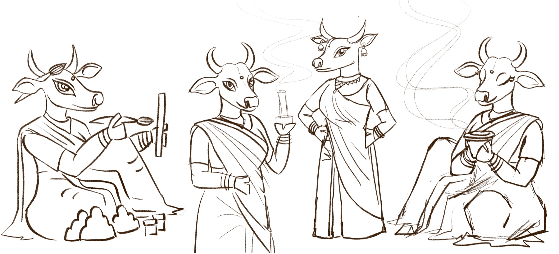
Kriti was designed as a small system of poses, each mapped to something the brand actually does — so she can host the whole range rather than pose for a single logo.
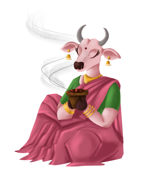
- At the altar — seated with a smoking dhoop bowl, and standing with a lit incense stick: she embodies the devotional products themselves.
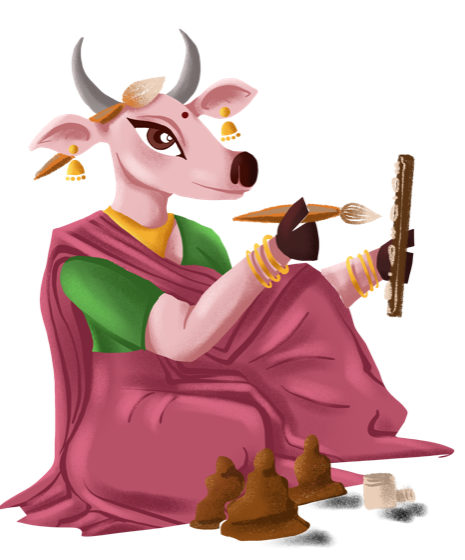
- At work — crafting with a brush beside handmade cones: she tells the made-by-hand story without a word of copy.
- As the face — the confident standing pose anchors packaging, profile and advertising.
A humble material, given a face you remember.
Drawn by hand
Every pose began as a line drawing. The whole character was hand-illustrated in Procreate — built from sketch to final colour, and kept as a time-lapse so the brand has its making on record.
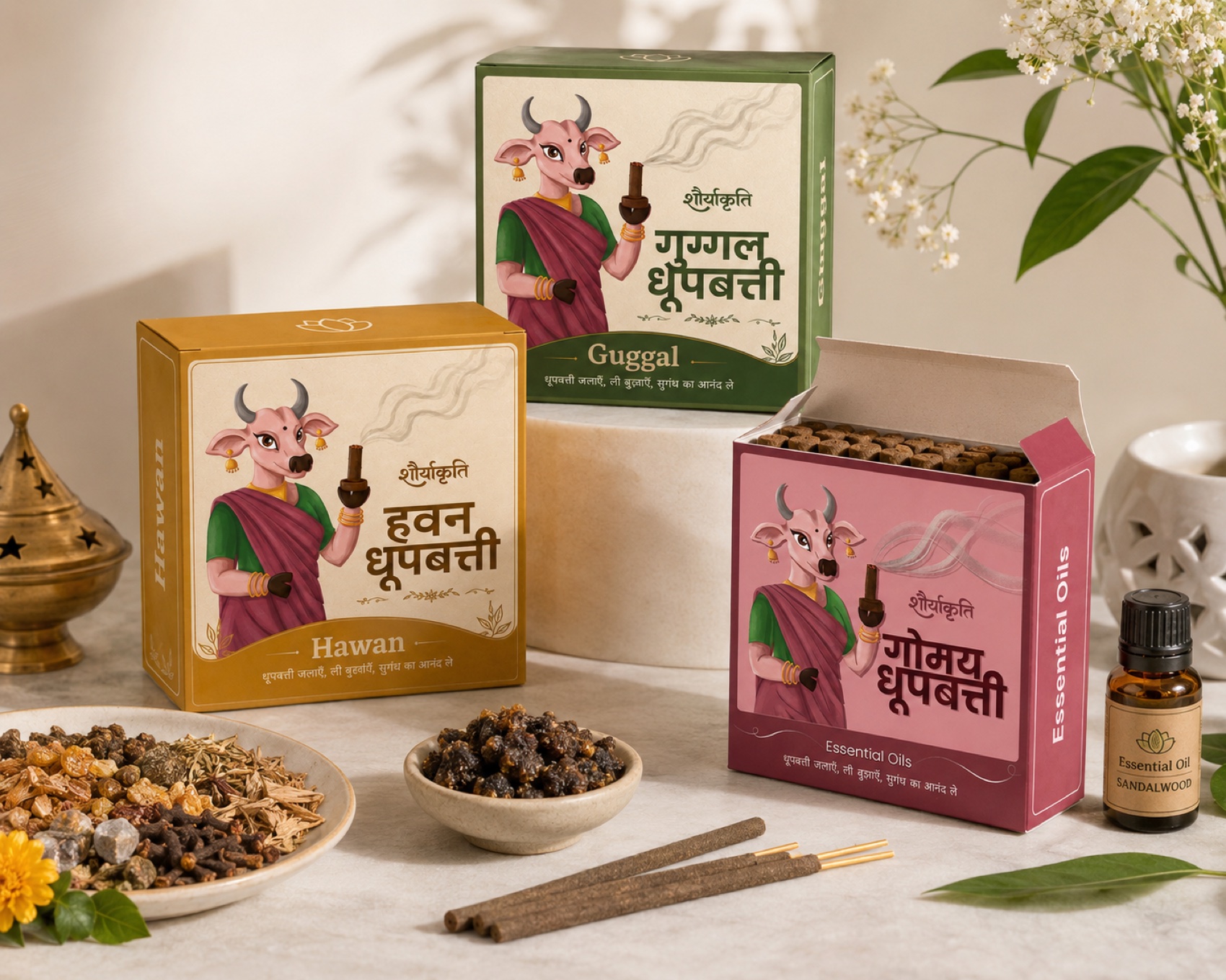
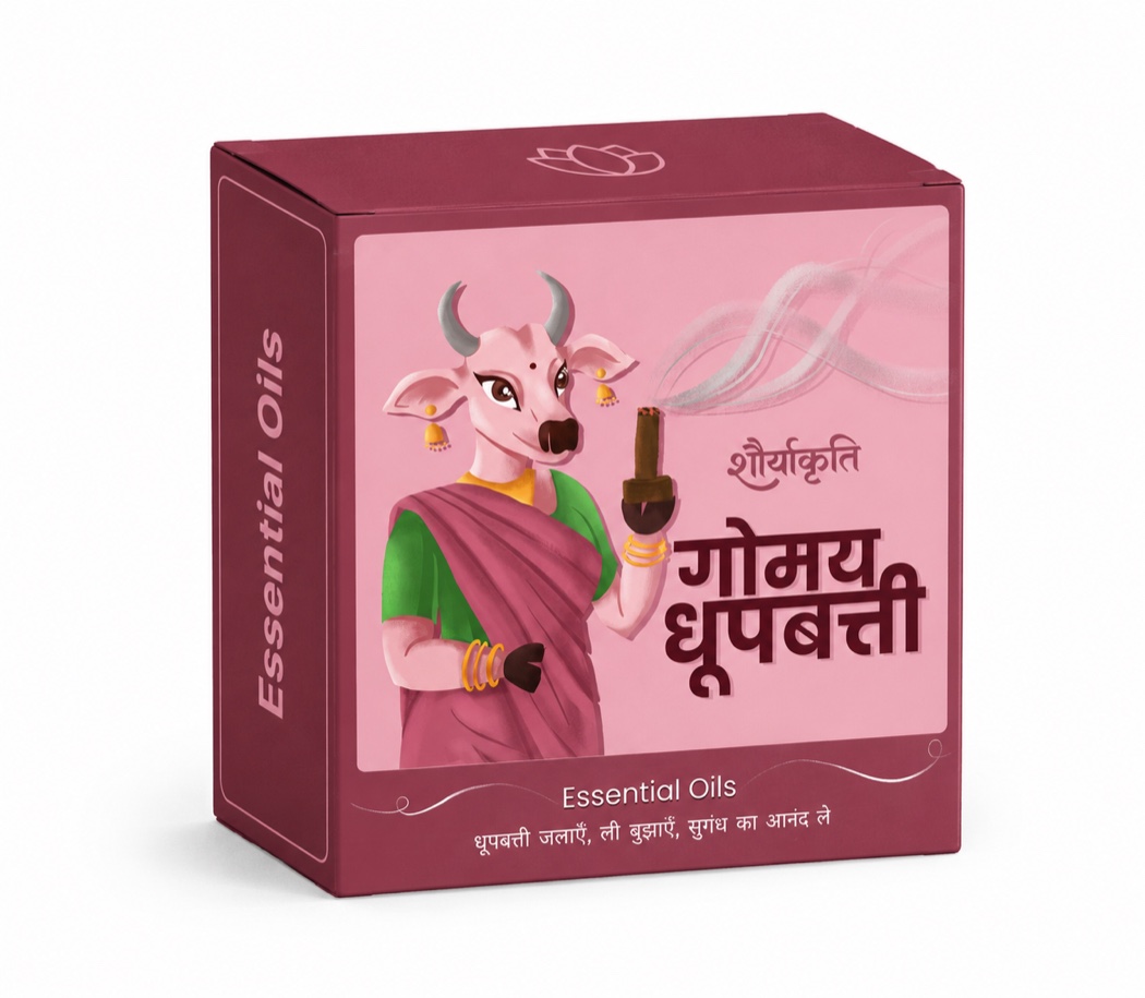
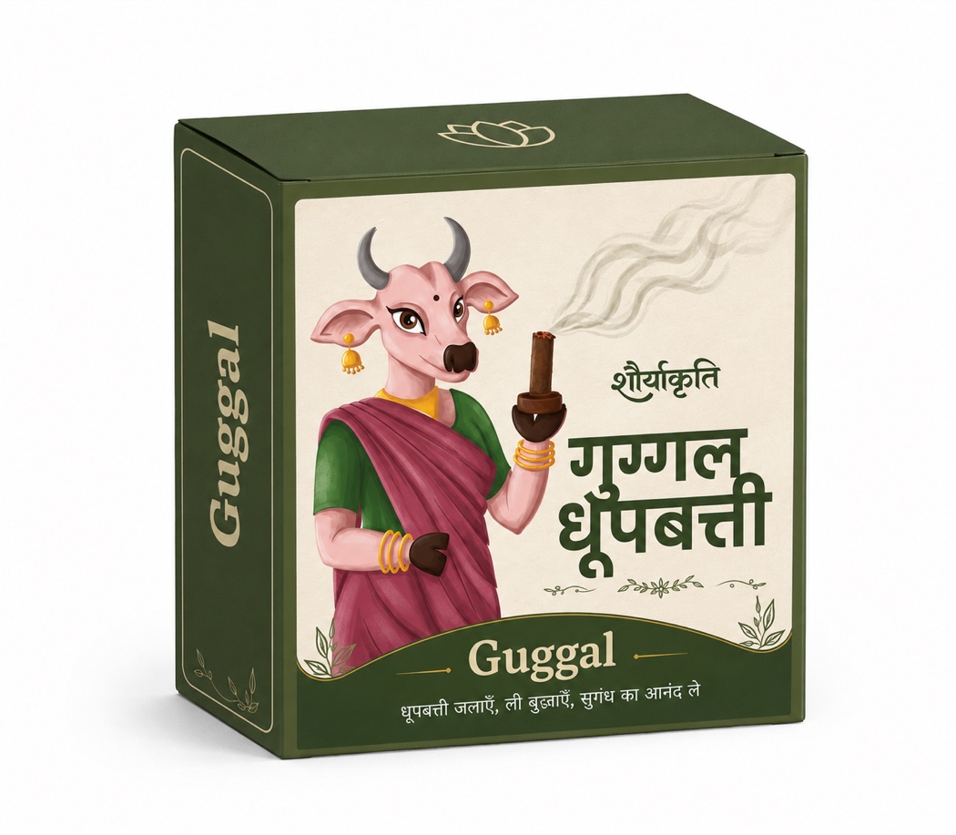
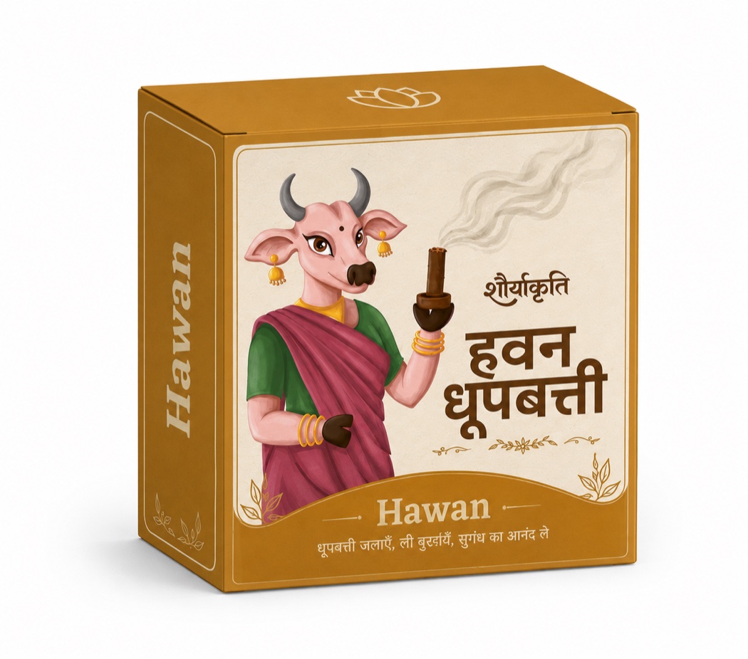
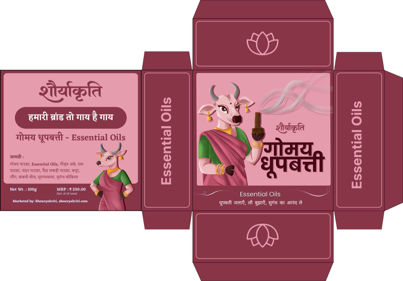
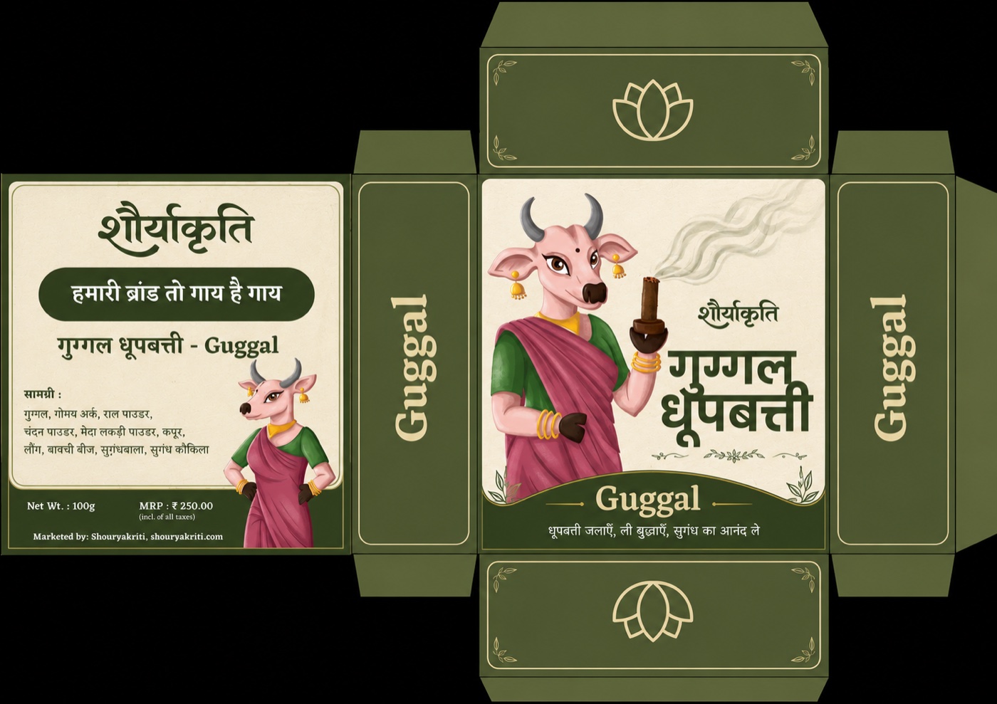
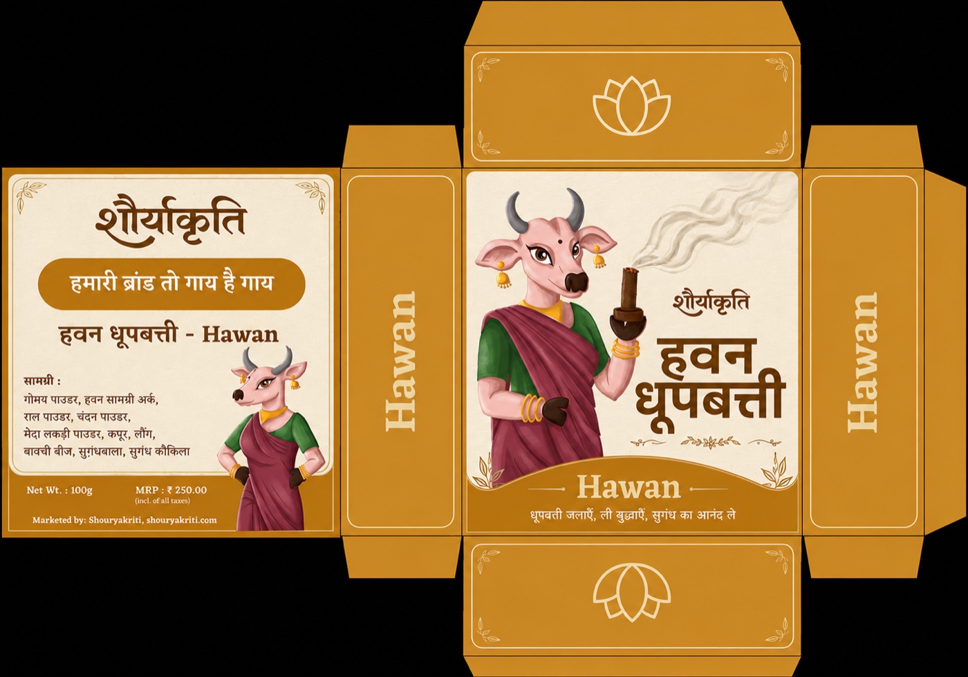
Packaging — Gomay Dhoopbatti
The first line off the brand: Gomay Dhoopbatti, a cow-dung incense range in three scents — Essential Oils, Guggal and Hawan. Kriti fronts every carton, mid-aarti with a lit dhoop, and each scent gets its own colourway — rose, olive and ochre — so the three read as one family and still separate on a shelf.
I designed each carton end to end: the Kriti illustration, the Devanagari + Latin lockups (शौर्याकृति · गोमय धूपबत्ती), the ingredient and regulatory panels, and the print-ready dielines.