Character & Mascot · Packaging
Mukhwas — the Gujju Aunty label system
A hand-illustrated character became the face of a traditional mukhwas range — one matriarch, a new saree for every flavour.
The brief
A traditional Gujarati mukhwas (mouth-freshener) range needed labels that felt authentic and nostalgic — rooted in home and ritual — while carrying the dense regulatory load a packaged food demands: full nutrition table, ingredients, FSSAI marks, MRP and storage notes.
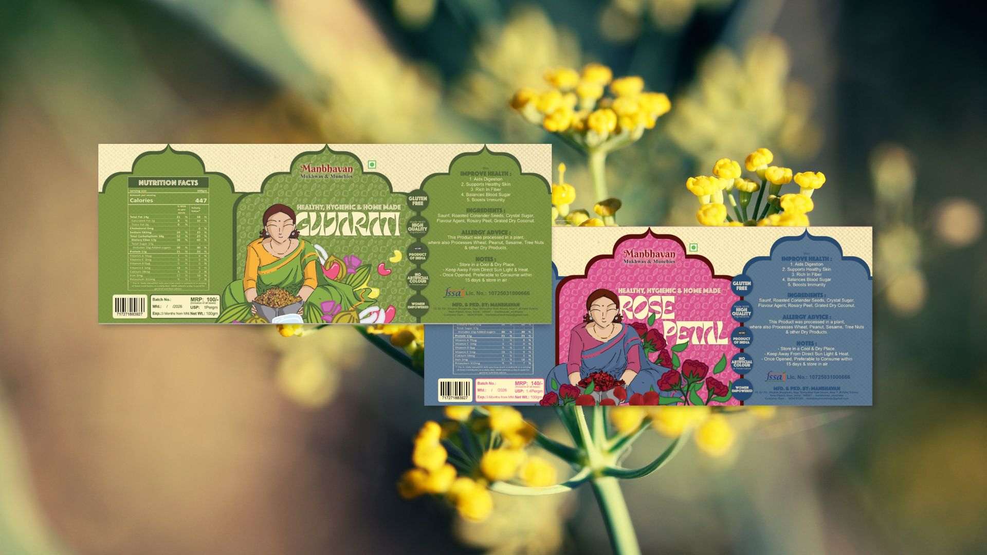
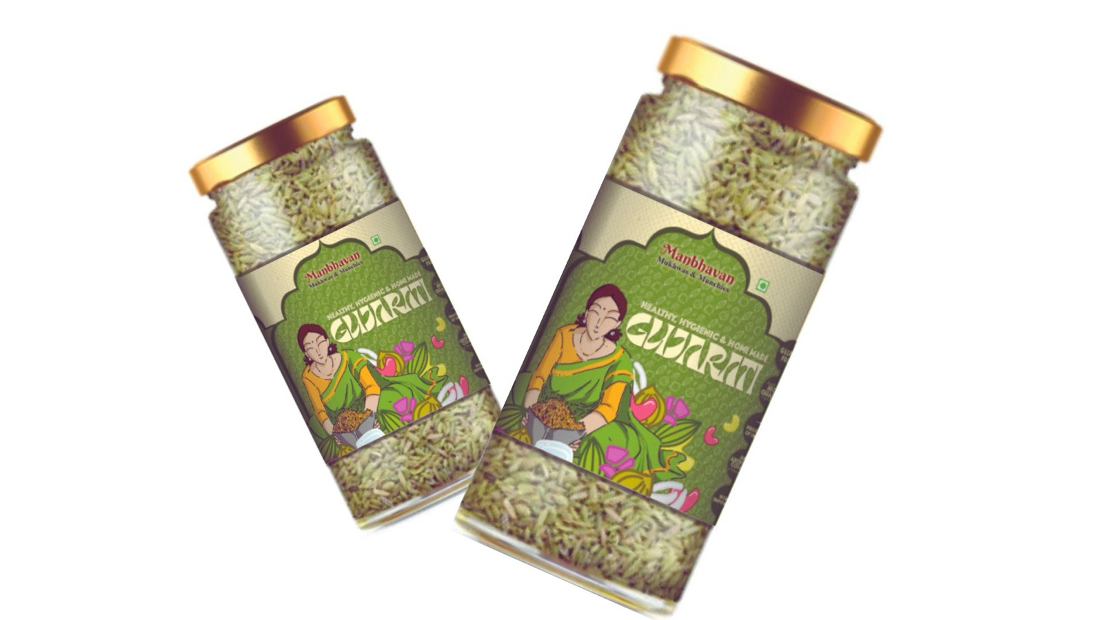
Two variants launched together: Gujarati (saunf / fennel, green) and Rose Petal (pink).
The character is the brand
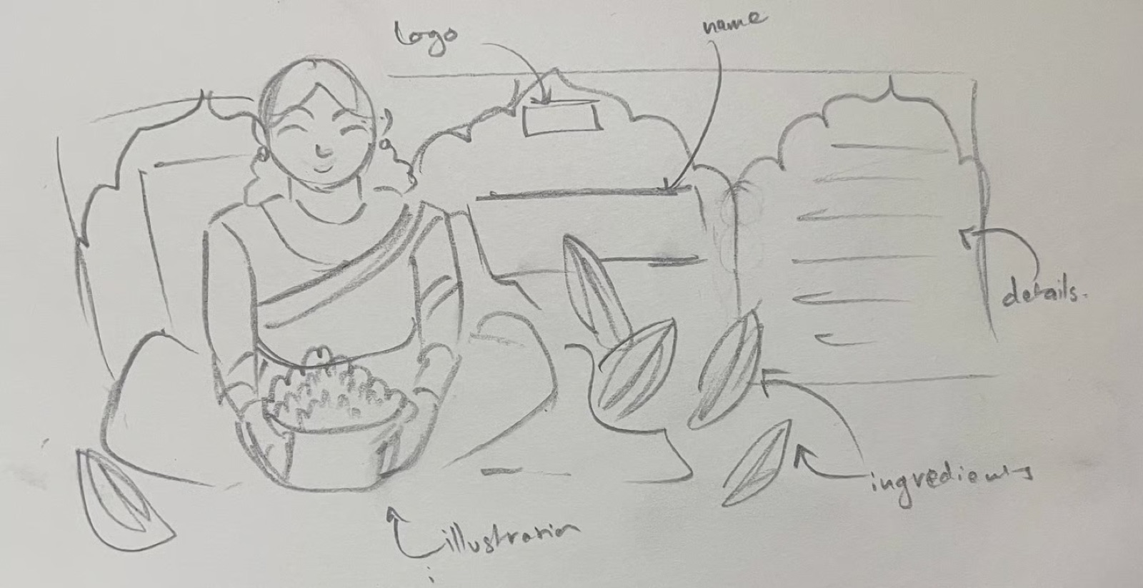
Rather than decorate the label, I built it around a person. A hand-illustrated Gujarati matriarch — warm, mid-gesture, sorting ingredients into a brass bowl — sits at the centre of every label.
She carries the whole promise — homemade, trustworthy, traditional — in a single glance, the way a mascot should. The illustration is the brand.
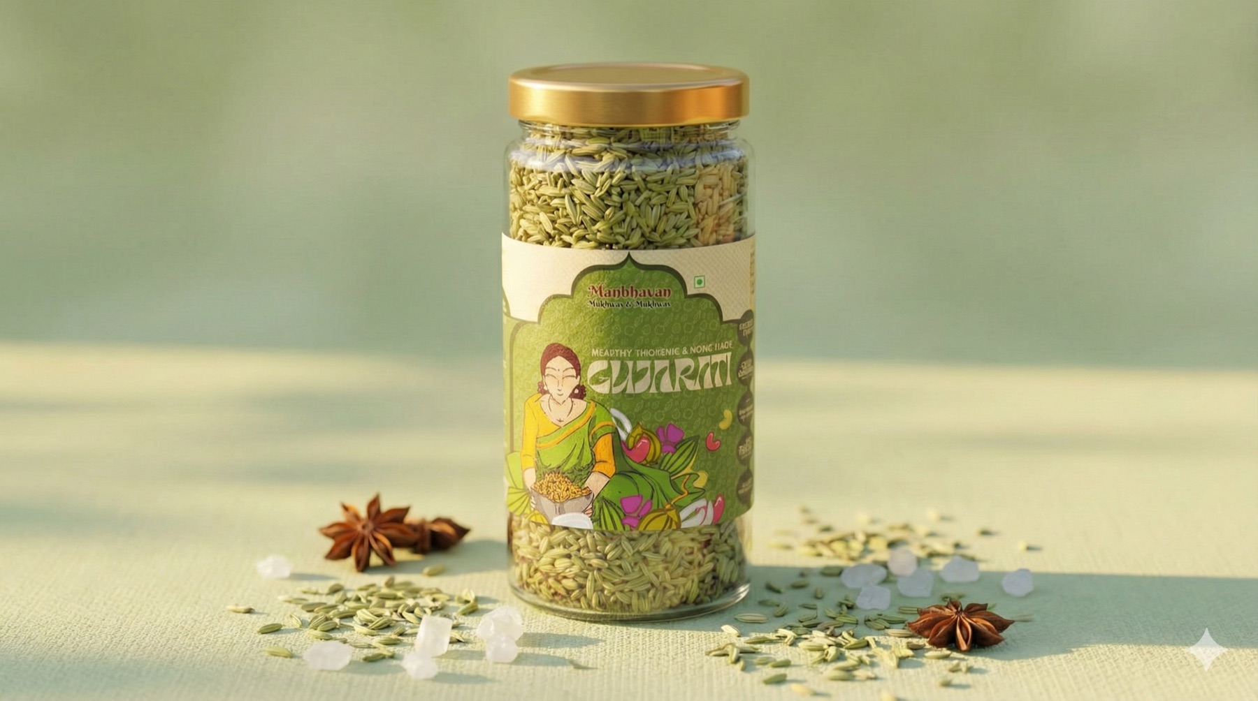
One character, a saree per flavour
Each variant re-dresses the same character. Gujarati wears green on a green dotted-halftone ground; Rose Petal shifts to pink. Keeping the figure constant and changing only her palette makes the range read as a family on the shelf — while a shopper can still tell the flavours apart from across an aisle.
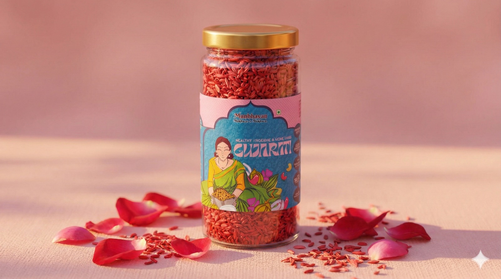
One matriarch, a new saree for every flavour.
Making regulation legible
The hard part of a food label is everything that isn't the picture. Three moves keep it readable:
- A temple-arch frame crowns each label — a containment device for the wordmark that signals heritage and separates brand from information.
- Maximalist illustration over a muted ground — bright character art on a subtle patterned backdrop keeps the dense regulatory type crisp and high-contrast.
- A structured type grid holds the nutrition table, ingredients and certification marks in clean order beneath the illustration.
The portrait and ornament were drawn in Procreate, then placed into Affinity Designer for the wordmark, the type grid, and print-ready output.