Editorial · Illustration
Illustration that goes to print.
Editorial & publishing work in an Indigenous Modern register — classical Indian iconography drawn for the contemporary shelf. A year-long Gujarati Bhagavad Gita hardcover, and a self-published line of coloring books shipping on Amazon KDP.
Publishing & editorial illustration
Two ends of the same craft live here. On one side, commissioned cover art for a regional-language publisher — illustration that has to survive a hardcover print run, a publisher's review cycle, and the shelf. On the other, self-published titles I wrote, illustrated, laid out and shipped end-to-end on Amazon KDP.
Both are built on what I call an Indigenous Modern approach: classical Indian iconography and the grammar of manuscript and visual Shastra, drawn for a contemporary reader. My training is in Applied Arts (BVA, MSU Baroda — double gold medallist), and it shows up as print discipline — line-work built to hold at scale, colour calibrated for ink, layouts paced across double-page spreads, and files prepared with bleed, spine and cover specs a printer can actually run.
A cover for the Bhagavad Gita
A regional Gujarati publisher commissioned the cover for a hardcover translation of the Bhagavad Gita. The brief was unusually demanding: carry the text's profound philosophical core while holding real commercial shelf appeal — and explicitly avoid the over-saturated, generic look of regional spiritual publishing.
My answer was symbolic, not literal. Rather than figurative battlefield scenes, I built the cover on two central symbols of the Mahabharata — the conch (shankha), the spiritual call to action, and Arjuna's bow-and-arrow — held in a centred, balanced composition. I structured the negative space and colour contrast around the Gujarati title typography so that type and image read as a single object on the shelf.
This was a 1+ year commission at 15+ hours a week — sustained iteration through institutional review, colour calibration, bleed margins and a hardcover spine, all the way to print-ready output. It is the kind of long-form, culturally specific work my Indigenous Modern practice is built for.
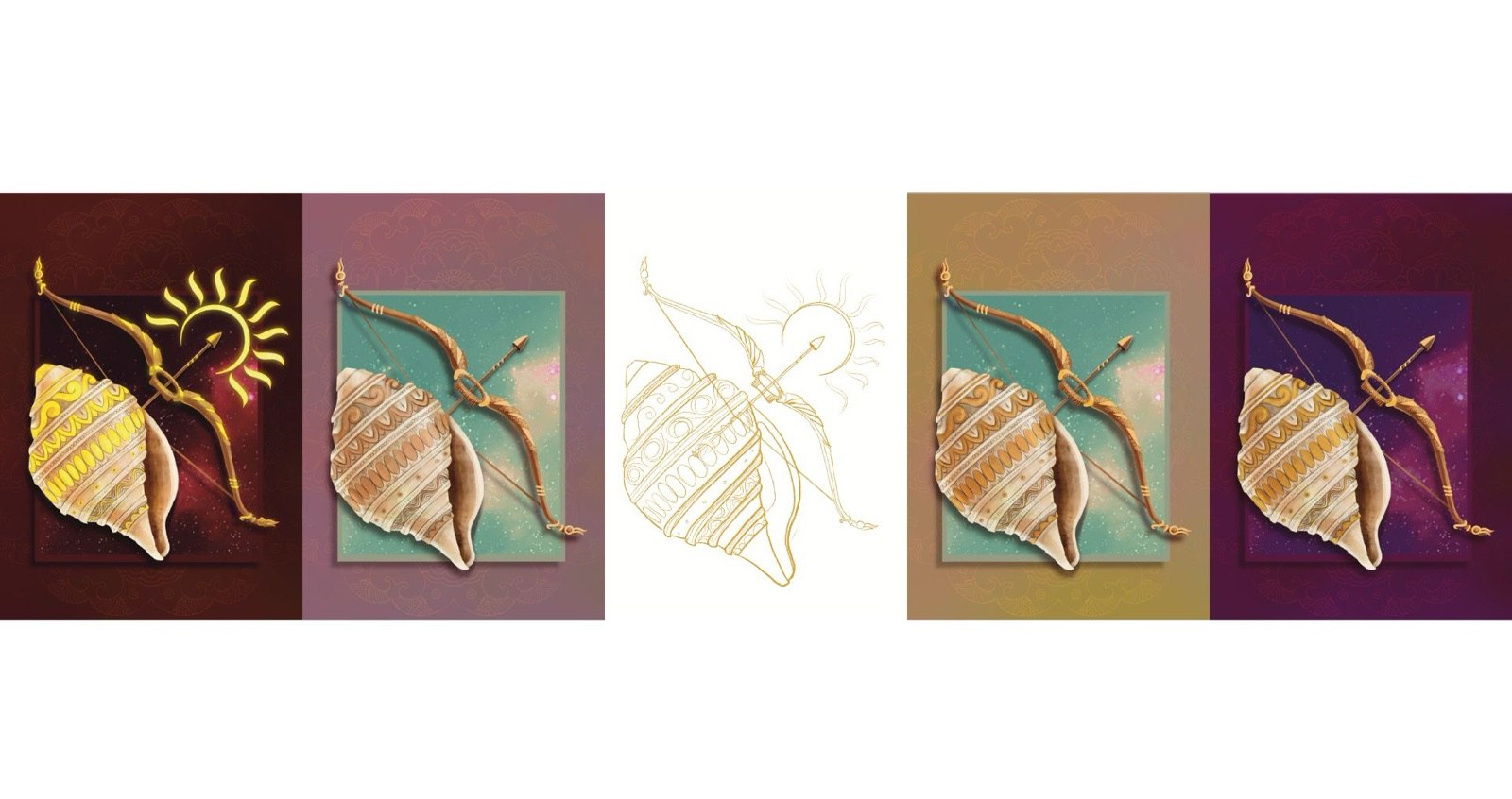
Finding the right register
I tested the composition across four colour directions before committing — a deep-maroon ground with a gold sun motif behind the bow, a gentle teal-and-rose study, a warmer ochre-and-teal mid-tone, and the deep-purple starlit field that became the final. A clean gold line-art version held the bow-and-conch composition at its most distilled, the same drawing reading as ornament, as symbol, and as type-companion.
Drawn in Procreate and finished in Adobe Photoshop and Illustrator for the typography and print preparation.
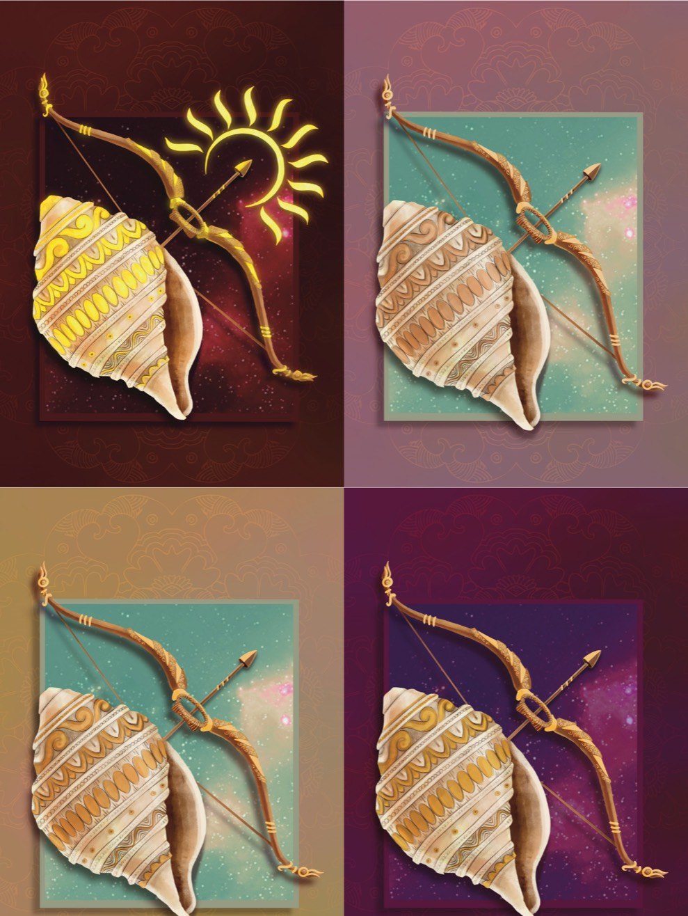
Symbolic, not literal — a philosophy carried by a conch and a bow.
Self-published on Amazon KDP
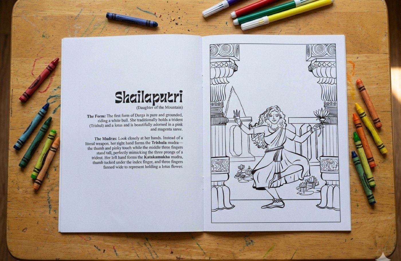
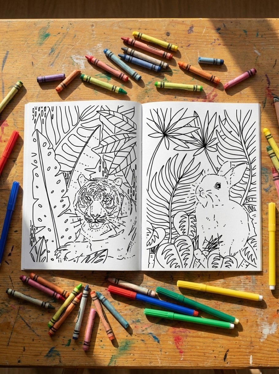
Alongside commissioned work, I run an active line of self-published coloring books — written, illustrated, laid out and shipped end-to-end on Amazon KDP, where I act as illustrator, author and publisher at once. This is the whole pipeline: manuscript, line-art, double-page spreads, cover, spine and print production.
- Nava Shakti — A Coloring Book. The nine forms of Goddess Durga, each rendered as colourable line-art and paired with a short descriptive text on the facing page. The line-work is drawn from my own full-colour Navadurga paintings — direct proof that I can derive clean, publishable line-art from finished art, and Indigenous Modern iconography put to work for a culturally themed audience.
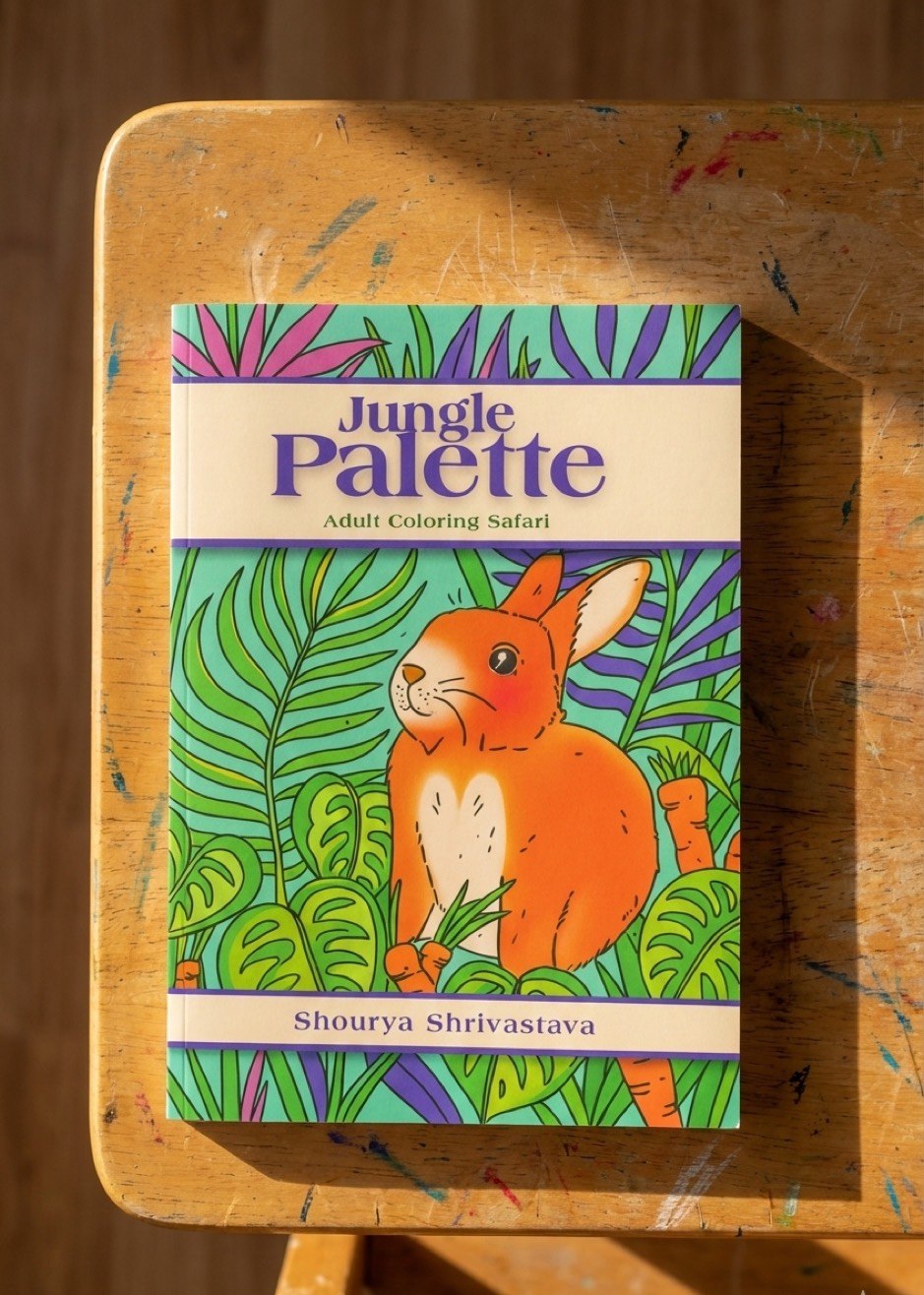
- Jungle Palette — Adult Coloring Safari. A second title aimed at a different reader: dense, detailed line-work with animals as focal points across lush botanical environments, positioned for the adult-coloring market.
Two distinct titles for two distinct audiences — a productised publishing line, not a one-off, and evidence that I can hold range across markets while keeping a consistent hand.
Tools & pipeline
I draw illustration and line-art in Procreate, finish covers and colour work in Adobe Photoshop, and use Adobe Illustrator (with Affinity in the mix) for typography and vector marks. Print preparation — bleed, spine, cover wrap and KDP spec — closes the loop from sketch to a file a printer can run.