Type
Kamal — a Devanagari display face drawn from temple geometry
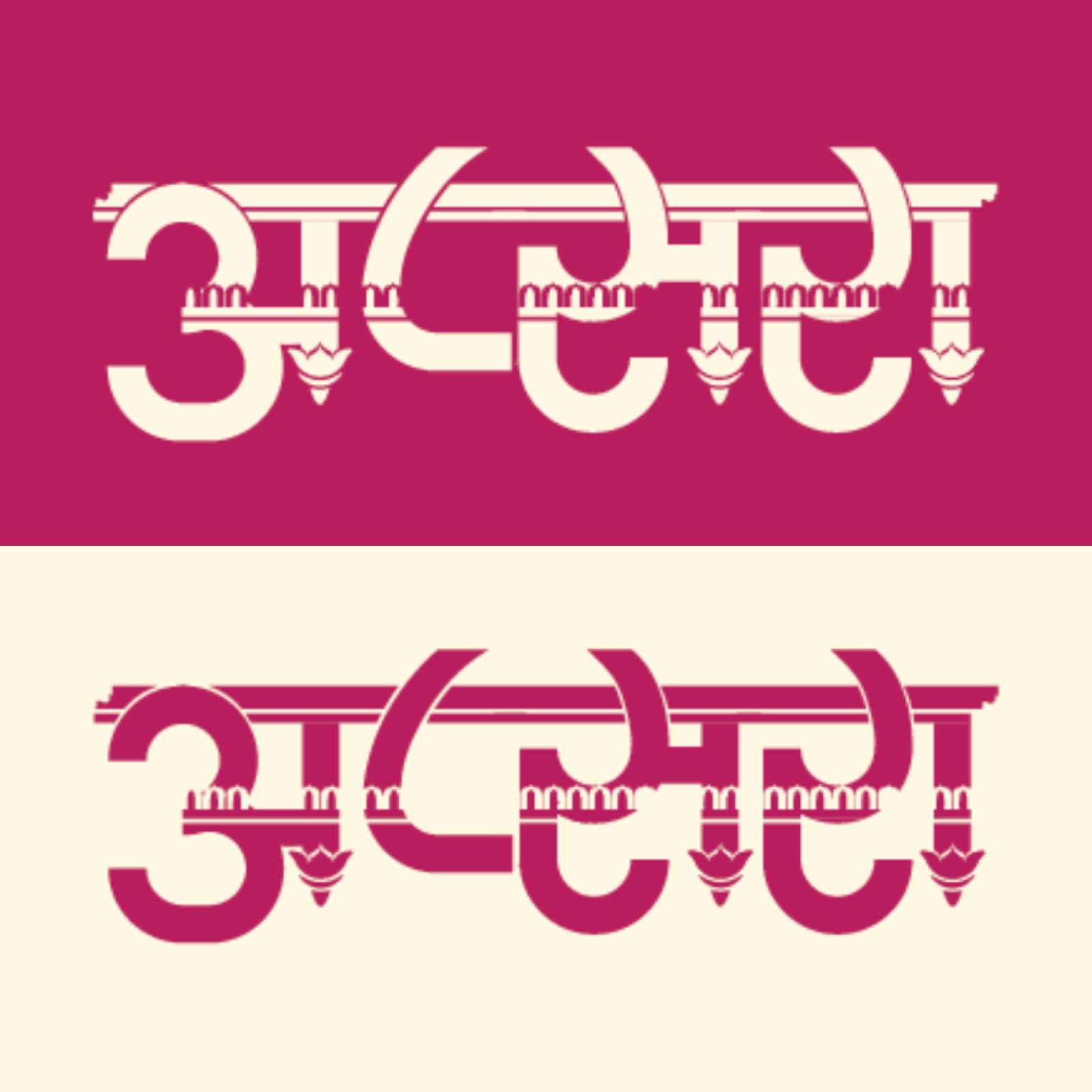
A complete ornamental Devanagari alphabet built like architecture, not decorated like it — pillars for stems, mandap arches along the headline, a lotus at the foot of every glyph. This is my structural method in its purest form: classical grammar, modern construction.
Architecture as alphabet
Kamal (कमल, lotus) is a Devanagari display typeface that treats every letter as a small piece of Hindu temple architecture. I set myself one brief, defendable idea: take the visual grammar of South Asian temples — towering pillars, carved shikhara finials, mandap arches and the ever-present lotus — and rebuild it as a working Devanagari titling alphabet. Not motifs applied to letters, but letters generated from the architecture.
The lotus is the keystone. It carries purity and spiritual awakening in Indian culture, it names the typeface, and it recurs as the structural foot of every glyph. The result holds geometric rigour and ornamental softness in the same stroke — exactly the Indigenous Modern position I work from: classical sources read through a contemporary, modular construction rather than nostalgia.
The letterform system
Every glyph is assembled from one consistent architectural grammar, so the whole script reads as a single building rather than fifty unrelated drawings:
- Verticals become pillar shafts — load-bearing stems, some carrying a carved capital or base.
- The shirorekha becomes a beam of mandap arches — the headline rule that ties Devanagari together is rebuilt as a row of miniature temple arches with finial detail.
- Terminals become lotus petals — the foot of nearly every glyph blooms into a lotus, the motif that gives the face its name.
- Counters carry carved detail — where an opening allows, small carved elements echo sanctum ornament.
The discipline is deliberate. Three shared parts, reused with intent — bold geometric line-work softened by carving, tuned for display sizes where the ornament earns its place. Because every form is derived from the same parts, consistency is structural rather than something I chase glyph by glyph.
A complete script
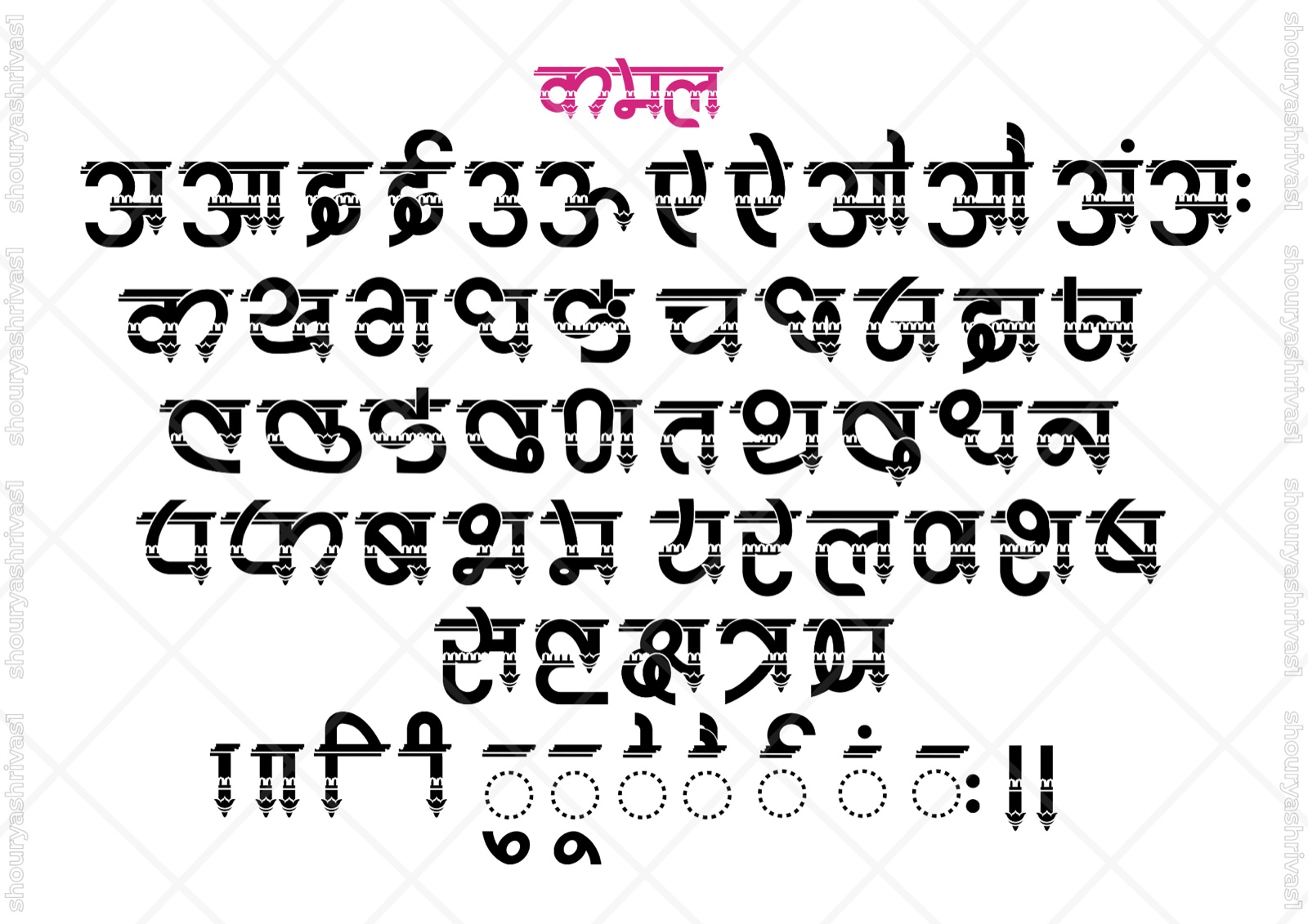
Kamal is not a sampler — it is a full Devanagari set. The character sheet runs the independent vowels (अ आ इ ई उ ऊ ए ऐ ओ औ) and the anusvara / visarga marks, the consonant block (क ख ग घ ङ … through the full series), the common half-letters and conjuncts, and the matras — the vowel signs that attach to consonants in real typesetting.
Holding the temple-arch headline, the pillar stems and the lotus foot consistently across that many forms — vowels, conjuncts and dependent signs alike — is the hard part of a typeface, and the proof that this is a system, not a handful of hero letters. Carrying one structural idea across 50+ glyphs without it breaking is the skill the whole project is built to demonstrate.

Pillars for the stems, arches along the headline, a lotus at every foot.
From graph paper to vector
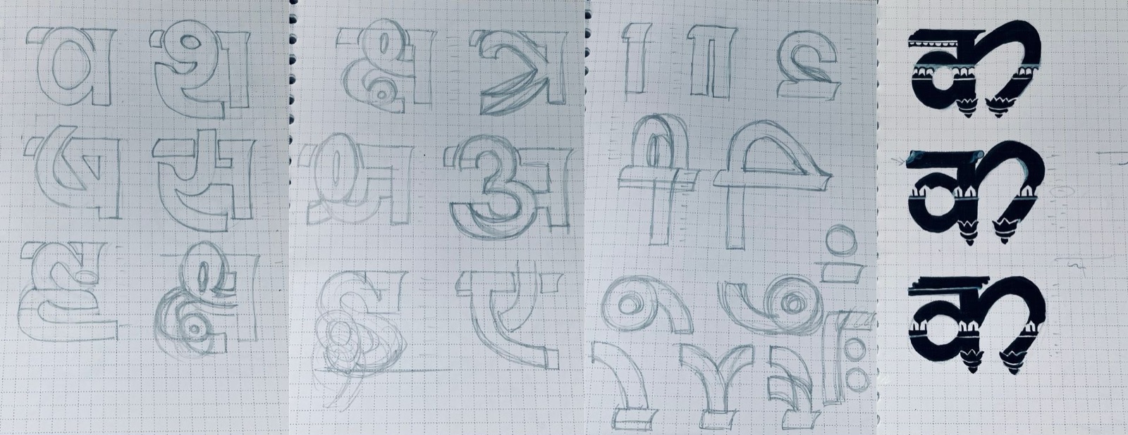
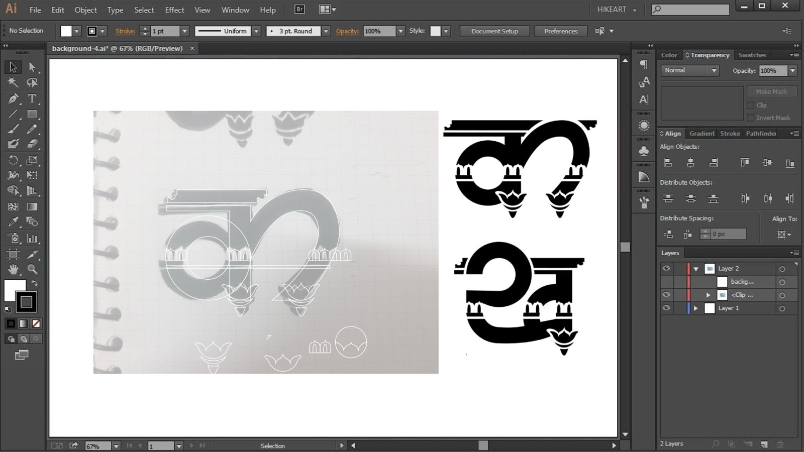
The method runs research → hand → screen. I began inside the temples themselves — studying structures, carvings and motifs until the proportional logic was clear — then worked the letters out in pencil on graph paper, building each glyph on a grid so the pillar verticals, the lotus base and the arch header anchored at repeatable proportions. A single letter like क went through several geometric variants before I locked the final form.
The resolved sketches were scanned and rebuilt as clean vectors in Adobe Illustrator, the photographed page sitting as a reference layer right beside the construction. Building the alphabet from three shared components keeps the system internally consistent and the spacing rhythm even across long words — the same proportional grammar of the visual Shastras I lean on across my work, here turned into a typeface.
Setting Kamal
Kamal is a titling face — built for headlines, book and publication titles, branding, and event identities that celebrate cultural identity, never for body text. At scale the ornament earns its keep: set large, the arch headline and lotus feet read as deliberate craft, not noise. It is made for the moment a name needs to carry meaning, not just be legible.
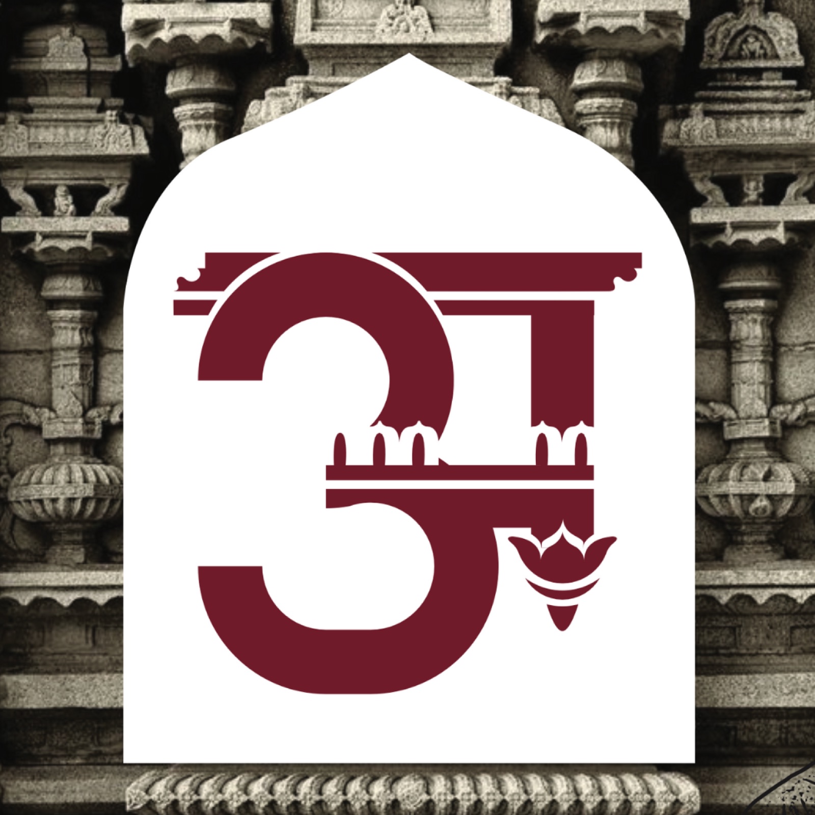
I tested the face in positive and reversed colour — maroon and pink on cream, and cream on pink — to confirm the heavy ornamental detail holds in both directions, and framed it inside a temple arch as a title card to show the headline context it was drawn for.
Tools
Pencil and graph paper for the structural sketches and proportion studies; the resolved letters scanned and constructed as vectors in Adobe Illustrator, working component by component so the lotus, arch and pillar shapes stay identical wherever they recur. The vector discipline carries through everything I make — the same precision I bring to Affinity Designer on commercial type and identity work.