Branding
Marks built on classical geometry.
A set of foundational identities for cultural and advisory brands. I draw each mark from a real classical Indian system — Shatkona, mandala, temple and Shastric proportion — used as structural grammar, not decorative motif, then pare it back to one clean, contemporary emblem. I call the approach Indigenous Modern.
An approach to foundational identity
Cultural and advisory brands — Vaastu consultancies, Jyotish educators, dance societies — usually default to a saturated, ornament-heavy aesthetic: too many symbols, too much gold, nothing that survives a favicon. I work the other way.
I trained in Applied Arts at MSU Baroda — a BVA, two gold medals — and the through-line of my practice is what I call Indigenous Modern: I take a piece of classical Indian geometry — a Shatkona, a damaru, a sun-mandala, a Gyaan Mudra — and treat it as structural grammar, not ornament. Each mark is set out through Shastric construction on real ratios and grids, then reduced to a single fine-line or solid emblem that holds at the size of a favicon and at the scale of an embossed cover. Sacred source, modern execution.
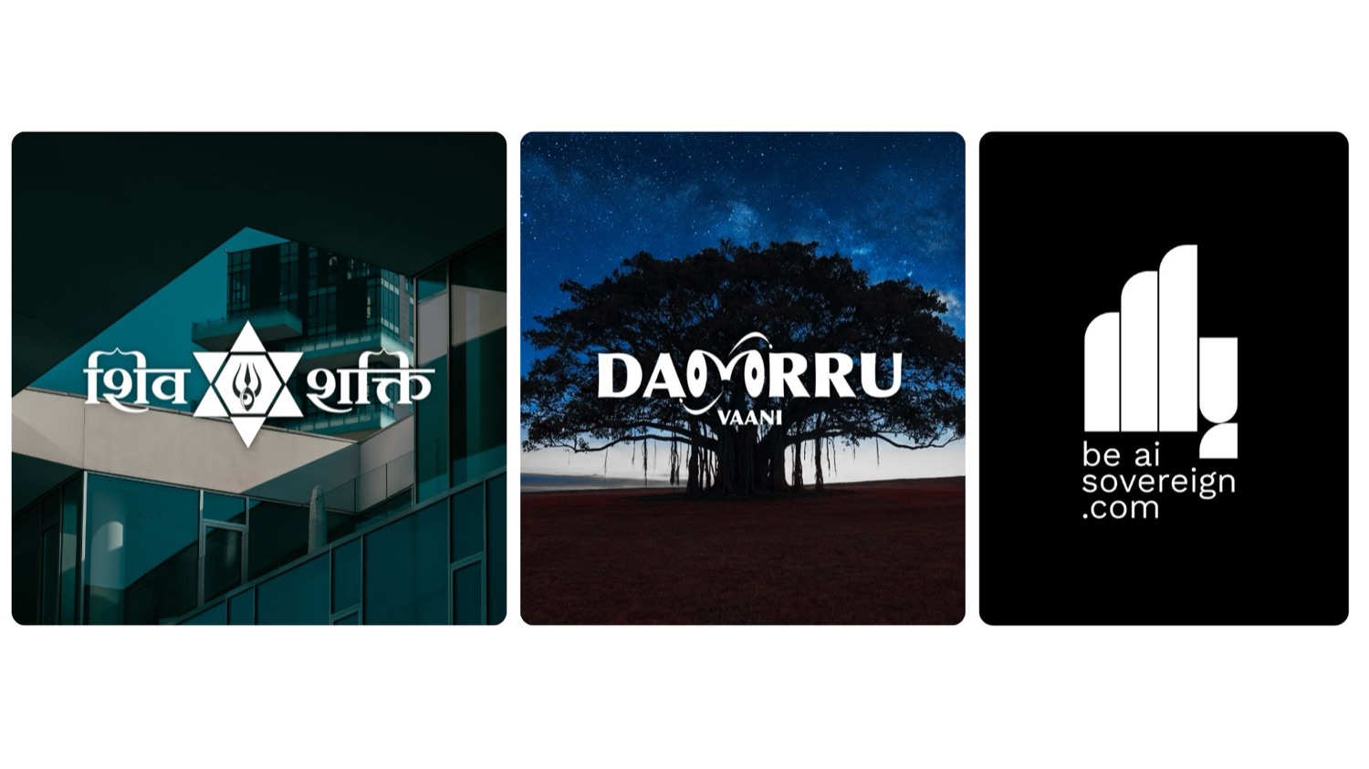
ShivShakti — the Shatkona & Trishul
A heritage Vaastu consultancy that needed to honour dualistic energies without the usual clutter. I anchored the mark on the Shatkona — two intersecting triangles for the masculine (Shiva) and feminine (Shakti) energies that sit at the centre of Vaastu thought — and used the hexagram itself as the load-bearing geometry, not a backdrop.
- One fused emblem — I let a central hexagon hold Shiva's third eye and Shakti's Trishul as a single lamp-like form, so two energies read as one mark.
- Built on a wireframe — I set out the six-pointed star, an inner hexagonal frame and the eye in pure line first, then added weight only where the construction earned it.
- Fine-line, not saturated — stark, minimalist iconography, the exact opposite of the category's default.
- A full system — deep-navy mark, "शिव शक्ति" Devanagari wordmark and the "वास्तु सलाहकार" tagline, carried through to printed visiting cards.
Dammru Vaani — the M-as-damaru wordmark
An educational startup teaching Vedic occult sciences — Jyotish, gemology, ritual practice — that had to read as mystical and academic, never ominous or clinical. I carried the whole identity on a custom logotype rather than a separate icon: here the wordmark is the brand.
- The double M — I reshaped it into one continuous, flowing geometric form that mirrors a damaru, Shiva's two-headed cosmic drum.
- One shape, two meanings — that same stylised M also reads as the eyes of a seeker. That double-read is the engine of the mark.
- Taken literal — a secondary lockup threads a fine-line Shiva-and-damaru figure straight through the centre of the type.
- Kept educational — a mustard-and-tiffany palette with paired Latin and Devanagari faces keeps it approachable, not occult-heavy.
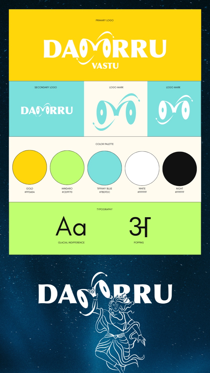
The same shape doing two jobs at once — a drum, and a seeker's eyes.
Shreeranga Nrityalaya — sun-mandala & dancer
An identity for a classical-dance culture and welfare society — a mark that had to carry both the institution's dance focus and a sense of cultural-mission scale. I used the mandala as the proportional spine: every element is pinned to its radial geometry.
- A sun-mandala in a warm yellow-and-orange gradient fans out as the dominant element — radial petals laid out on even, repeating geometry.
- A dancer at the centre — a white silhouette in classical pose, the body curves traced cleanly and aligned to the mandala's radial lines, so figure and frame share one grid.
- A confident name set — "Shreeranga Nrityalaya" in a serif beneath, with "Culture and Welfare Society" as a smaller ranged-and-ruled sub-line.
- Reads as a plaque — placed on an earth-stone ground so it holds equally as institutional letterhead or a printed mark.
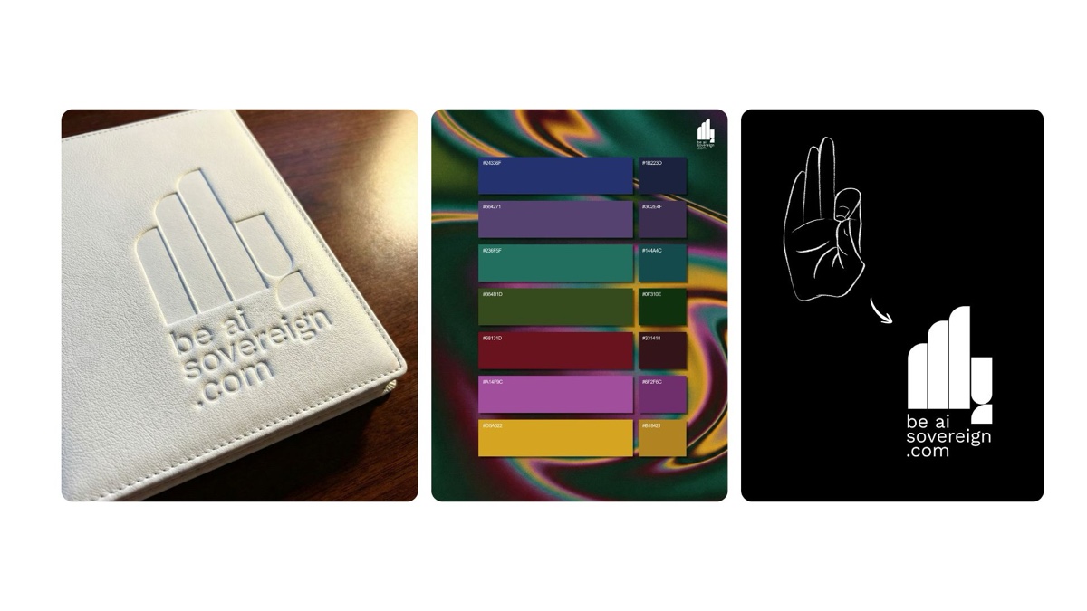
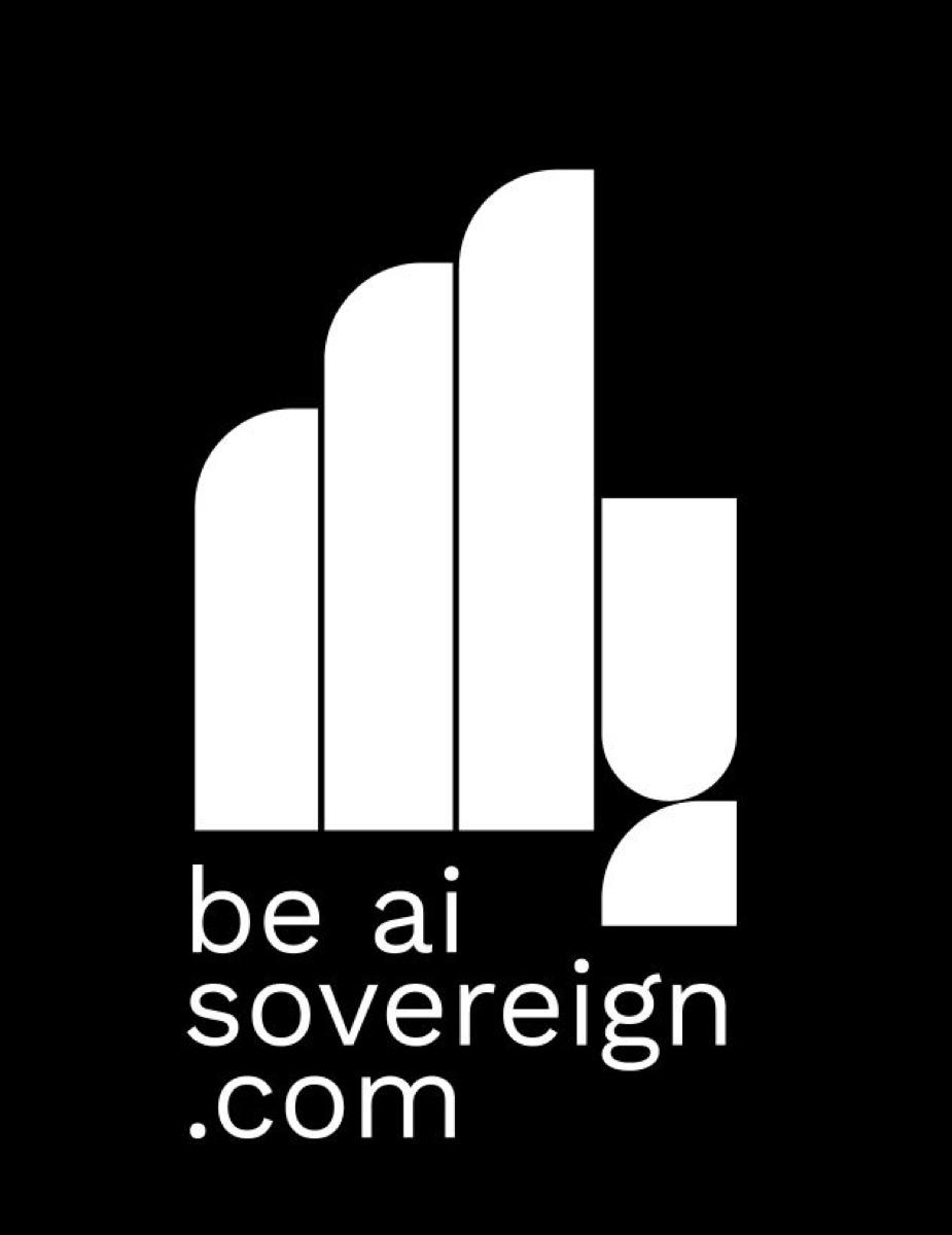
be AI Sovereign — the brutalist Gyaan Mudra
A tech-forward brand merging self-sovereignty with artificial intelligence. The ask: translate the Gyaan Mudra — the gesture of knowledge, thumb and forefinger touching — into a form that scales from a leather-embossed cover down to a favicon. This is the same Indigenous Modern method pushed into a brutalist register.
- Aggressively abstracted — I drew no figurative hand and rebuilt the gesture entirely from brutalist, solid geometric shapes.
- Pillars and a loop — three thick vertical pillars for the upright fingers, with a lower curve closing the loop where thumb and forefinger meet.
- Two readings at once — the emblem holds as both "knowledge gesture" and "abstract data column," depending on where it lands.
- Digital-first, print-proven — a strict sans-serif system that stays clean on black for developers and debosses cleanly into white leather.
The through-line & tools
Across all four, my method is the same. I start from a real piece of classical Indian geometry — Shatkona, damaru, mandala, mudra — and use it as the structural grammar of the mark, not a surface motif. I construct it honestly on a grid, then strip it to a single emblem that carries one idea cleanly and survives every size, from favicon to embossed cover.
Each mark also does double duty — an eye that is also a drum, a column that is also a gesture, a star that is also a lamp — so one shape can hold a whole brand. Three of these — ShivShakti, Dammru Vaani and be AI Sovereign — anchor my Cultural Logo Design series on Behance. I sketch in Procreate and build the final vectors in Affinity Designer (and Adobe Illustrator) for print-ready, scalable output.