Packaging
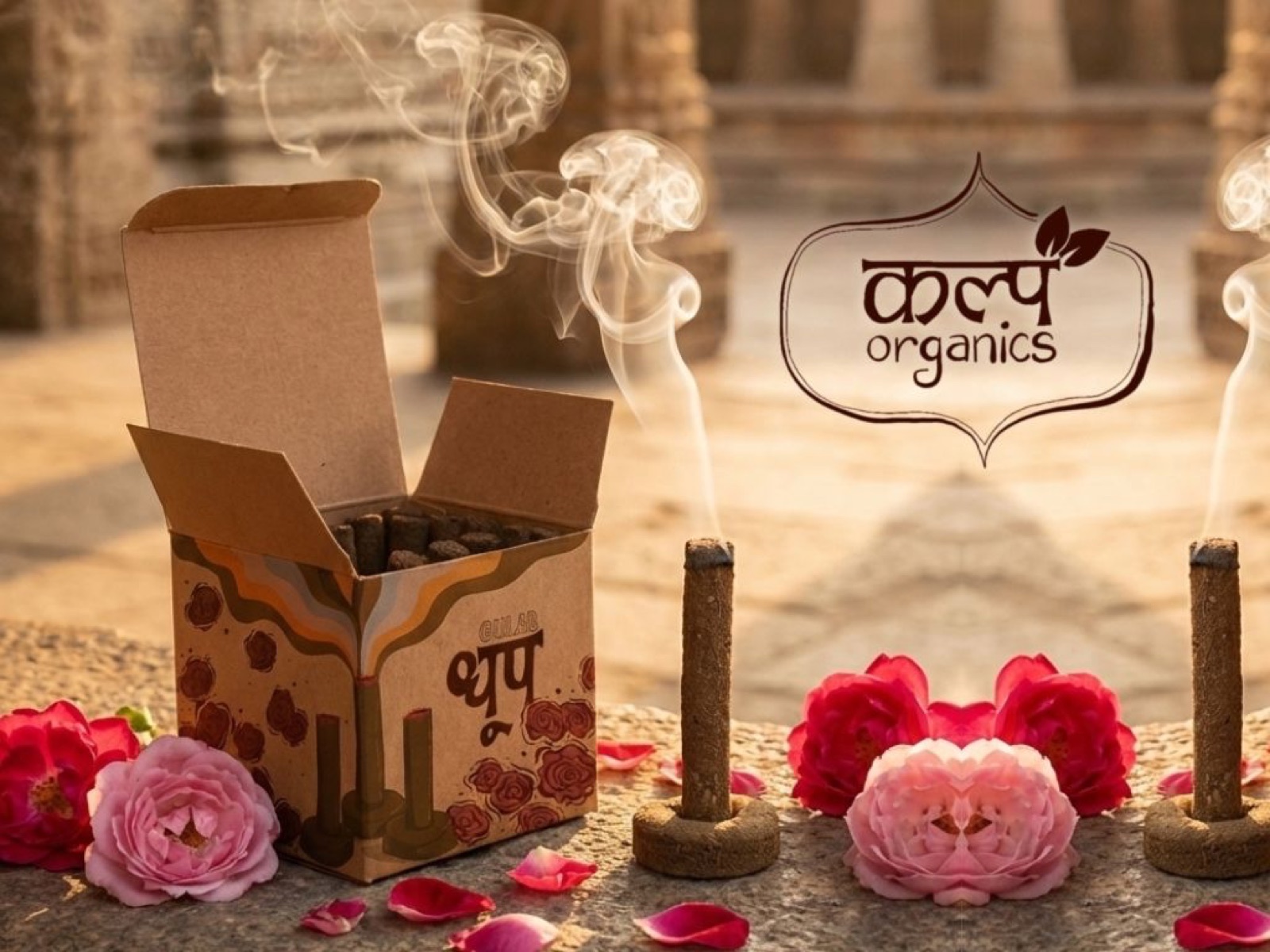
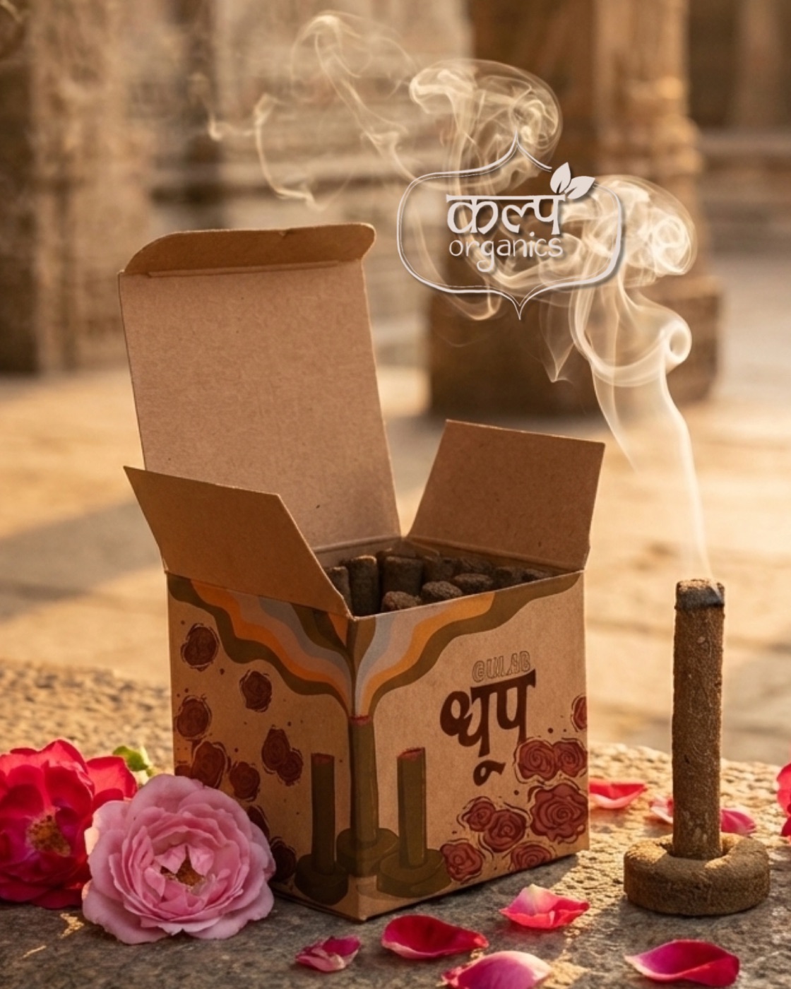
Kalp Dhoop — incense in raw kraft
Premium organic dhoop packaging where I let the substrate carry the eco-conscious signal, and hand-drawn botanicals tell the two variants apart from across an aisle — sustainability you can feel before you read a word.

The brief
Kalp Organics were launching Kalp Dhoop, a line of premium organic incense cones in two variants — Gulab (rose) and Chandan (sandalwood). The packaging had to read as genuinely organic and sustainable without reaching for the soft, default visual language of most "natural" Indian FMCG — the green inks, the leaf icons, kraft used as a cliché rather than a material.
It also had to separate the two variants cleanly enough to hold its own on a crowded devotional shelf, where dozens of incense boxes compete in the same brown-and-gold register. My job was to make Kalp Dhoop legible at arm's length and distinct at a glance.
Let the material talk
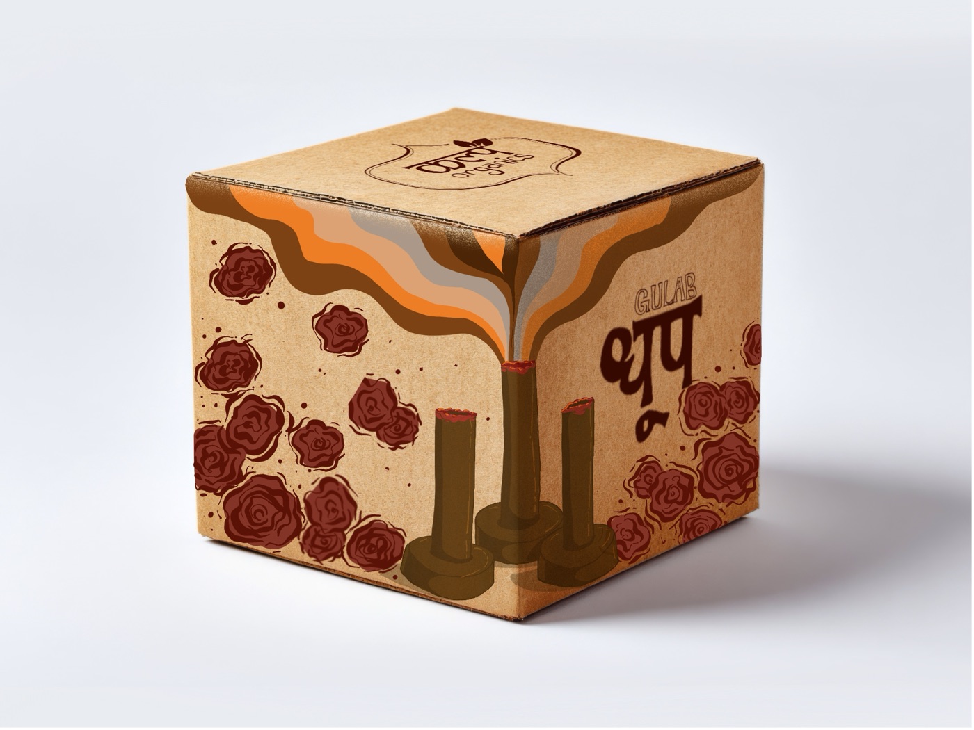
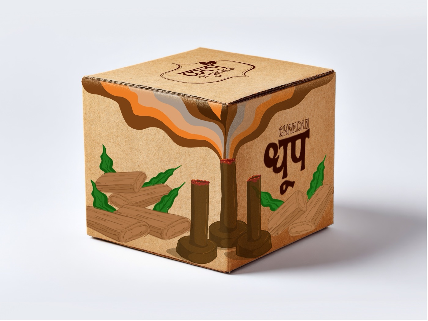
Instead of treating sustainability as a graphic style, I let the substrate do the talking. The whole system is built on raw kraft paper — its colour, fibre and grain carry most of the "organic" signal on their own, before a single mark is printed. The honesty is structural, not decorative.
The illustration then sits on top as a hand-drawn, ingredient-forward layer: roses for Gulab, sandalwood logs and leaves for Chandan. The principle is simple — what's inside the box is what's on the box.
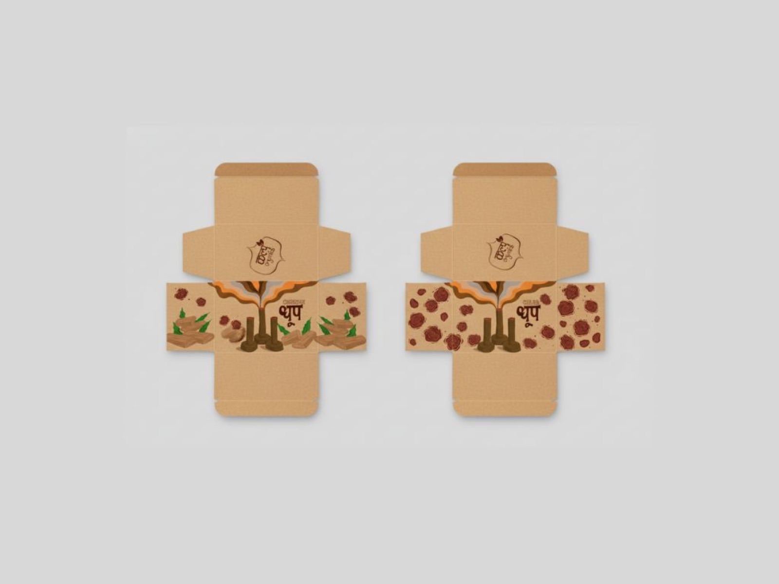
The system
Three elements give the range its identity and hold the two variants together as a family:
- Fluid smoke geometry — I drew the smoke as thick ribbons of brown, orange and cream, pulled across every face of the box rather than rendered as realistic wisps. It acts as the connective grammar: a continuous gesture that wraps the construction, links the two variants, and leaves room for the botanicals beneath.
- Hand-drawn botanicals — roses on Gulab, sandalwood logs and leaves on Chandan, scaled large enough that the variant reads from across an aisle. Each is the literal ingredient inside, not a generic flourish.
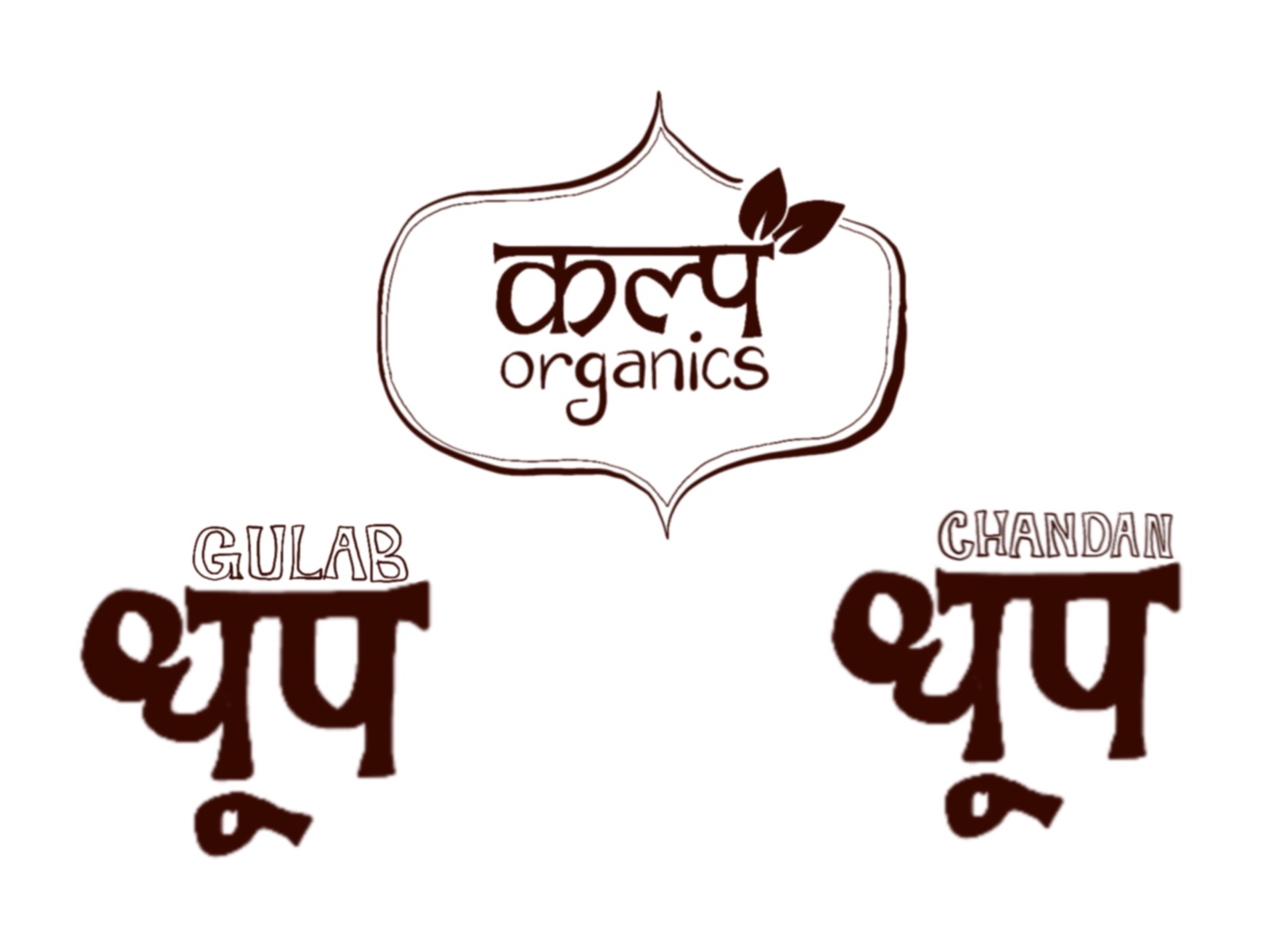
- A Devanagari wordmark — धूप set as the central type, with the variant name (GULAB / CHANDAN) above in English. Bilingual without ever feeling translated, anchoring the range in its devotional context while staying legible to a wider shelf.
Both boxes share one construction; everything that distinguishes them is carried by the illustration and the wordmark. One grid, two voices.
What's inside the box is what's on the box.
From dieline to shelf
I delivered the full launch system: the parent Kalp Organics logo and two variant wordmarks, two cube-box dielines drawn print-ready, two finished package mockups, and lifestyle photography for the launch set.
I drew the standalone botanicals — the rose cluster and the sandalwood arrangement — as reusable elements, so they extend cleanly across collateral: Instagram launch posts, product cards, and any future variants the range grows into. The system is built to scale, not just to ship one box.
Tools: Procreate · Affinity Designer — Procreate for the original illustration, Affinity Designer for the wordmarks, dieline construction and print-production file.