Branding
A 75-year institution, rebuilt from the grid up.
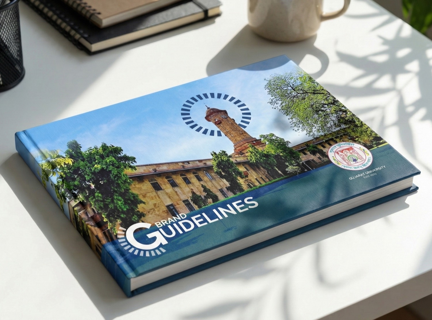
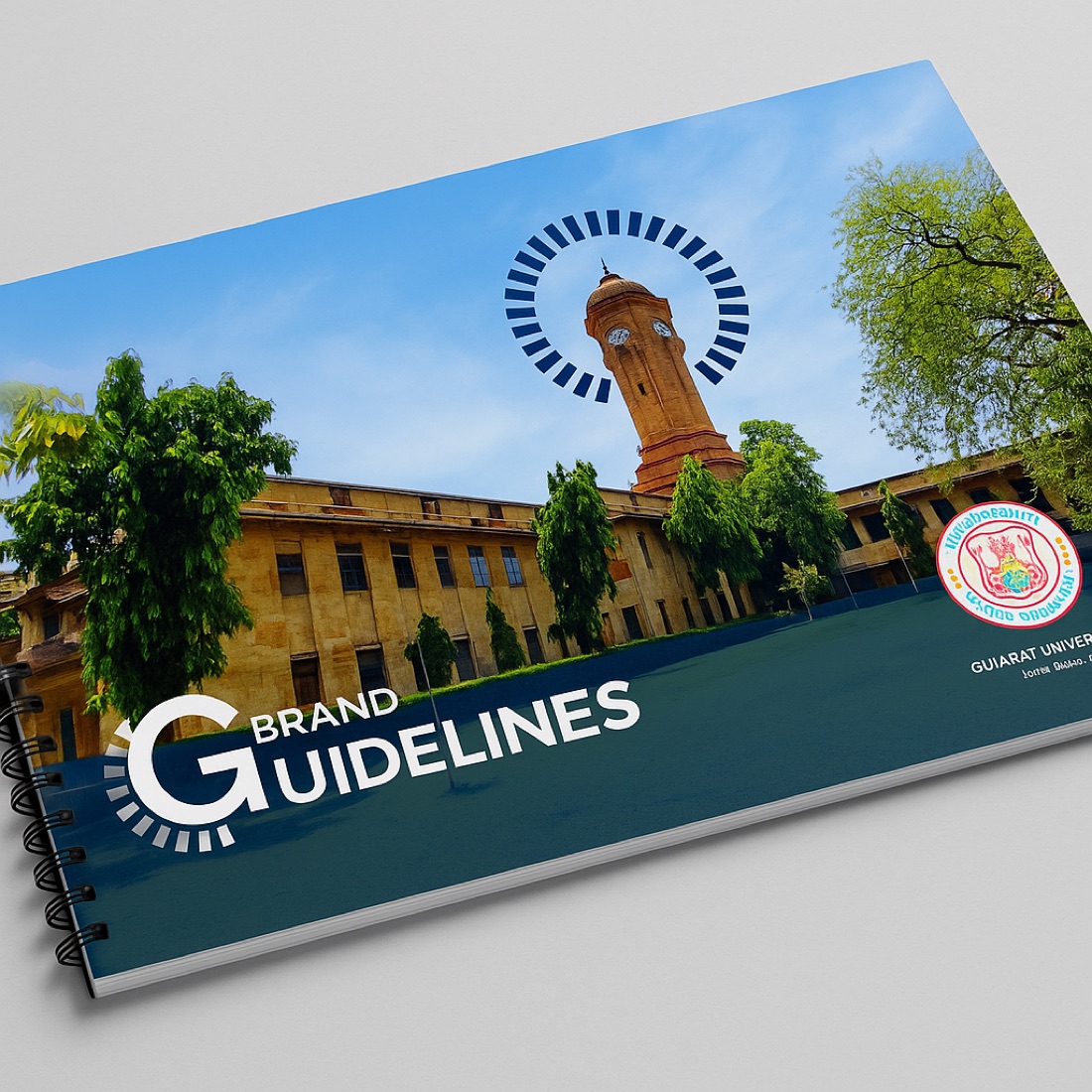
A complete identity system for Gujarat University's 75th anniversary. I built it around a single brand device drawn from the campus clock tower, then carried that one geometry across 40+ assets in nine weeks — a 128-page guidelines book, a 16-section anniversary publication, a full campus wayfinding system, and commemorative collateral.
The brief
Gujarat University, established in 1949, was approaching its 75th anniversary and needed an identity equal to that weight — one that could speak for an institution of its scale without surrendering its place in Gujarat's cultural and architectural history. A refresh that looked modern but read as inherited.
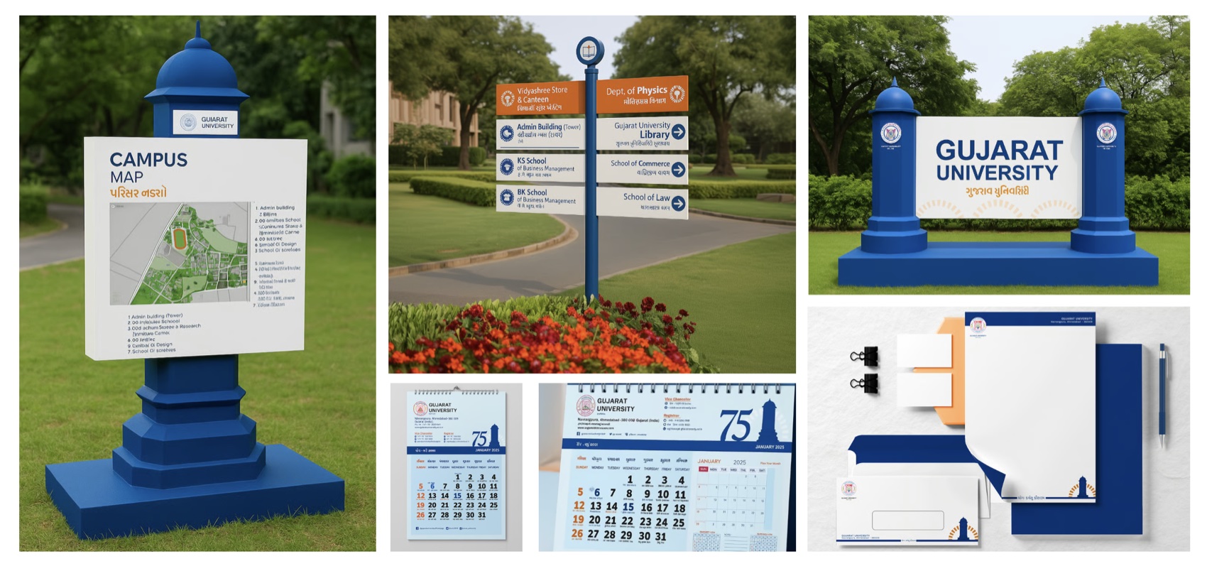
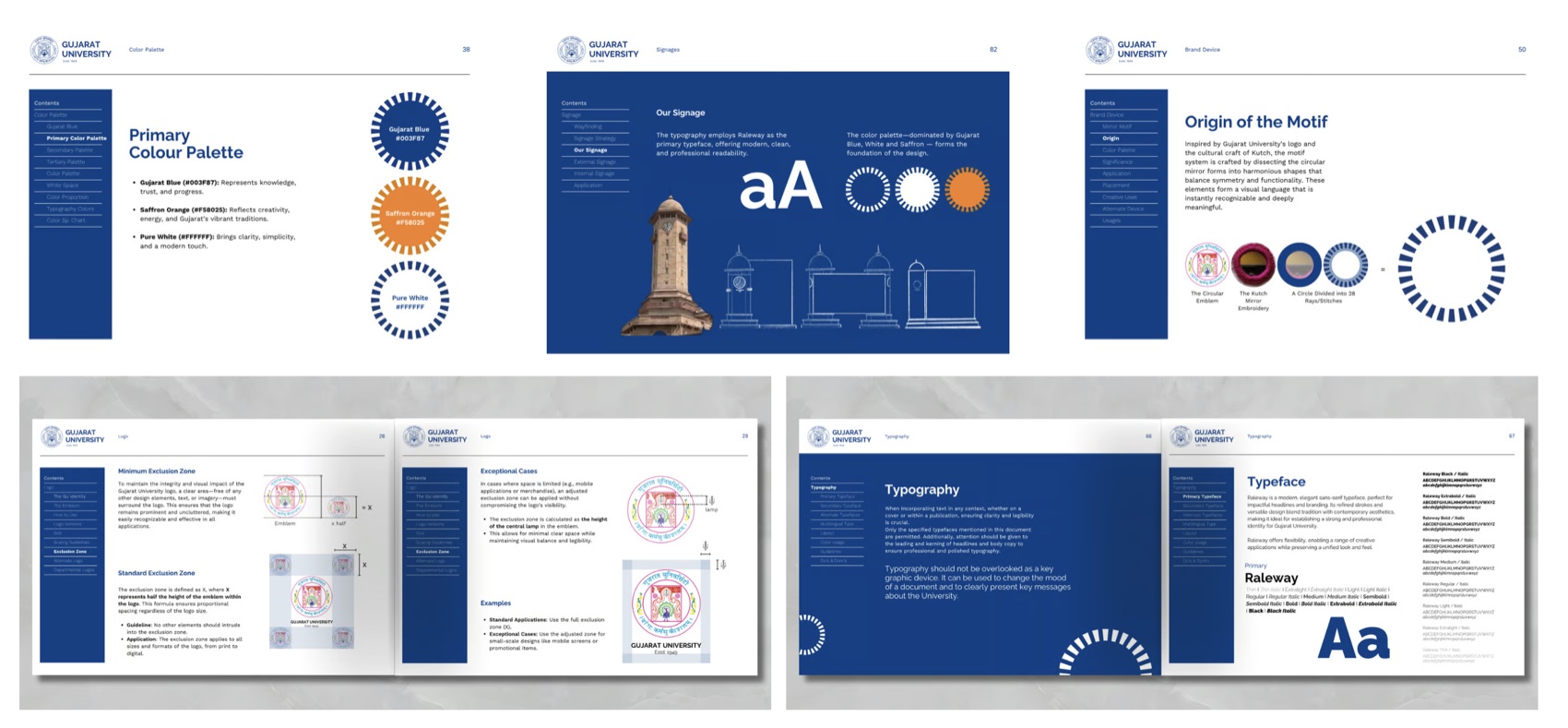
The scope was institutional, not cosmetic: 40+ assets across nine weeks, spanning five streams — a 128-page guidelines book, a 16-section anniversary publication, a campus-wide wayfinding and signage system, and a 75th-anniversary calendar. The same identity had to hold on a 2cm letterhead crest, on a four-metre campus monument, on a phone screen, and across every page of the manual that would outlast my involvement. That meant designing a system, not a logo — and that is the part of the work I specialise in.
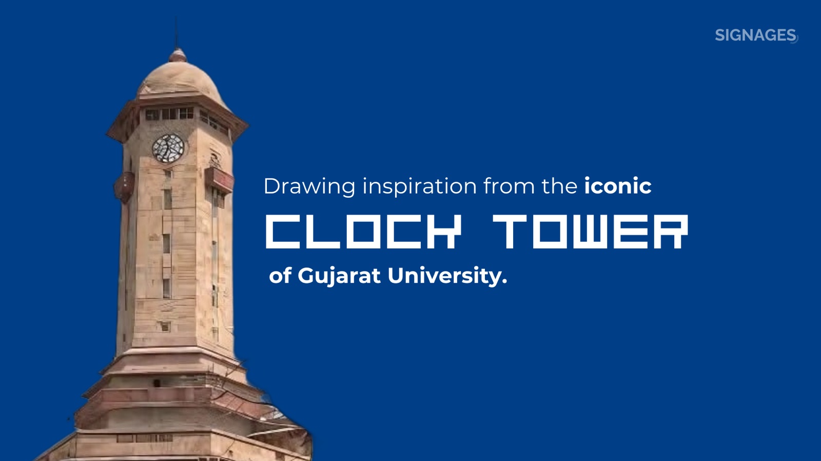
A mark drawn from the tower
My method is what I call Indigenous Modern: I treat classical Indian geometry — the proportional logic of temple architecture and manuscript layout — as the structural grammar of a system, not as decoration laid on top of it. Heritage governs the grid, the proportion, and the hierarchy; the surface stays contemporary. So rather than invent a generic emblem, I derived the headline device from a real architectural source: the historic clock tower at the heart of the GU campus.
The tower carries the institutional memory. A radial mirror-motif halo, drawn from Kutch embroidery, carries the regional specificity — built as repeatable geometry, not a one-off ornament. Both are constructed on a single proportional grid, which is why the mark survives the journey from a 2cm crest to a building-scale monument without redrawing or distortion.
A system, not a logo
The mark anchors a full 128-page brand guidelines book governing the logo system, the mirror-motif device, exclusion zones, palette, typography, and a dedicated signage chapter. This is the document an institution relies on when it needs the seventeenth piece of collateral to sit beside the first without anyone seeing the seam — and it is where the structural grammar pays off, because the rules, not my hand, hold the system together.
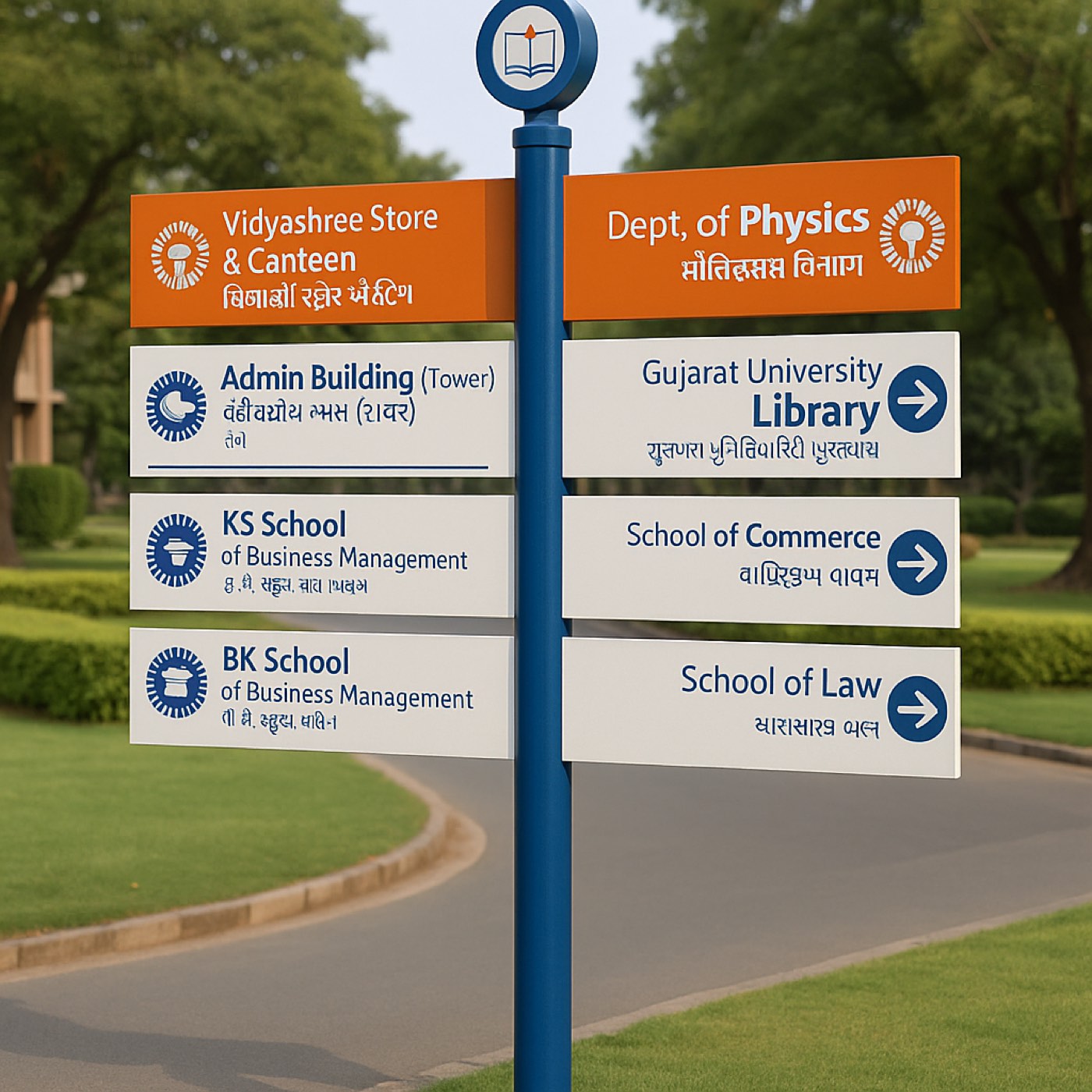
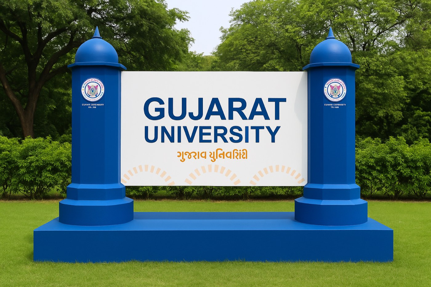
The same tower silhouette becomes a pillar device: every campus sign reads as a small domed pillar, formally consistent from welcome monument to building plate. I drew the whole family as a blueprint inside the brand book before a single sign was fabricated — so the system existed as logic before it existed as object.
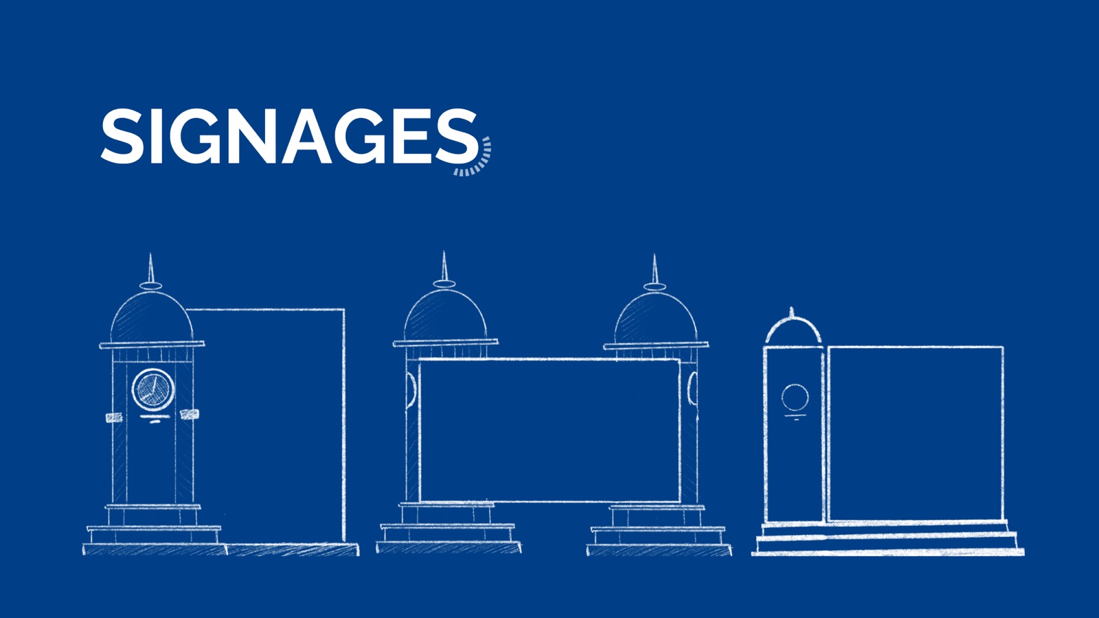
One device, from a 2cm crest to a four-metre monument.
On the campus, on the page
From there the system met the institution. Wayfinding ran from the main-entrance monument and multi-directional signposts to campus-map pillars — each bilingual in English and Gujarati, each governed by the brand-book rules so the next sign can be built correctly without me in the room.
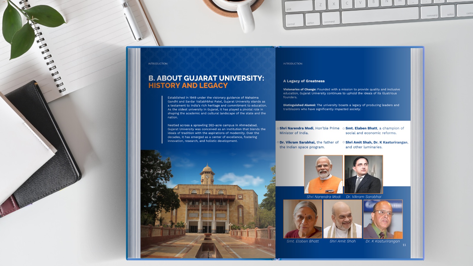
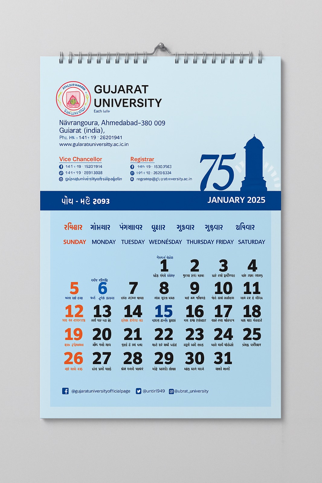
Two long-form pieces carried the anniversary in parallel. The 16-section “75 Years of Excellence” publication structures the institution's whole story — history and legacy, research, achievements, alumni, and the Vision 2047 / Centenary 2049 roadmap — as both a printed keepsake and a downloadable PDF. The 75th-anniversary calendar, in wall and desk formats, keeps the “75” mark and tower silhouette in front of faculty and stakeholders every month of the jubilee year.
I built the systems and editorial in Adobe and Affinity, and used Procreate for the mark exploration and the hand-drawn ornament — the same tool-set I bring to every institutional rebrand.