FMCG Packaging:
Cultural Storytelling & Sustainable Design
Packaging Design, Brand Illustration, Visual Hierarchy
Role: Lead Brand Designer (Freelance Agency Partnership)
Timeline: January 2025
Tools: Adobe Illustrator, Photoshop
project duration
1-2
20+
Hours/week
Weeks
tools used
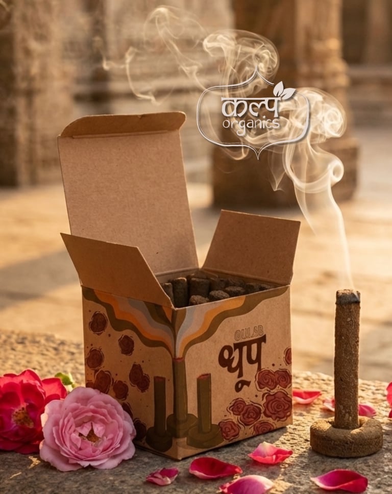
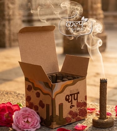
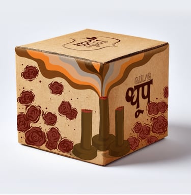
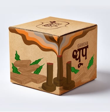
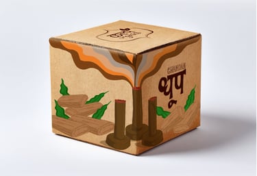
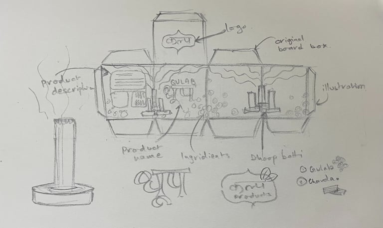
Kalp Dhoop
(Organic Incense)
The Concept: Kalp required a packaging solution that visually communicated the organic, sustainable nature of their premium dhoop (incense). The design needed to differentiate between two distinct aromatic profiles—Gulab (Rose) and Chandan (Sandalwood)—while maintaining a unified, earthy brand presence.
The Execution:
Sustainable Aesthetic: The foundational design relies on a raw kraft-paper texture, immediately signaling eco-consciousness and natural origins to the consumer.
Bespoke Botanical Illustration: Hand-drawn entirely in Procreate, the illustrations bypass standard vector icons. The Gulab variant features deep, rich red floral clusters, while the Chandan variant utilizes raw sandalwood logs and green foliage, allowing the ingredients to serve as the primary visual hook.
Fluid Geometry: The smoke from the incense cones is illustrated as thick, flowing ribbons of color that sweep across the top of the box. This creates a tactile, modern visual representation of "essence" and aroma spreading through a room.

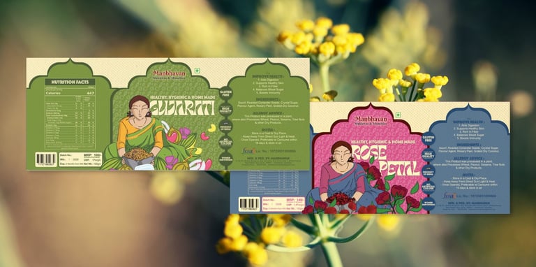
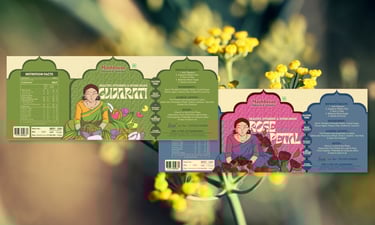
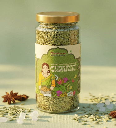
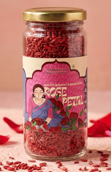
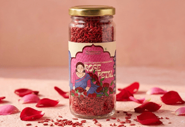
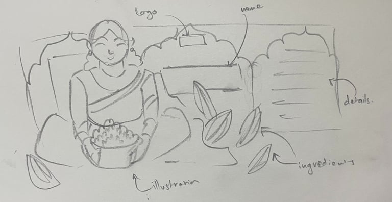
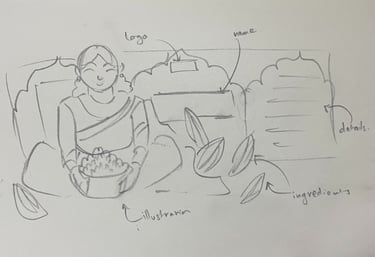
Manbhavan Mukhwas
(Heritage Edibles)
The Concept: A label design for a traditional Gujarati flavor mukhwas (mouth freshener). The client needed a design that felt deeply authentic, nostalgic, and culturally rooted, while also functioning strictly as a compliant food label containing dense nutritional data.
The Execution:
Character-Driven Storytelling: The centerpiece of the label is a custom, hand-illustrated portrait of a Gujarati woman preparing the ingredients. This grounds the product in a sense of "home-made" authenticity and traditional craft.
Architectural Framing: The label structure is heavily influenced by classical Indian architecture, utilizing sweeping traditional archways and decorative motifs to separate the visual art from the technical data.
Data Integration & Typography: Executed via a workflow between Procreate (for the art) and Affinity (for the layout), the design successfully balances the vibrant, maximalist illustration with strict typographic grids. The nutrition facts, ingredient lists, and brand certifications are cleanly organized on a muted green backdrop, ensuring the label is both beautiful and highly readable on a glass jar.

Let's create something adbhut together.
Branding I Packaging I Illustration I Book covers I Concept art
Get in touch
© 2026. All rights reserved.
Follow me on:
Contact