Foundational Identity Systems
Brand Identity, Typography & Visual Strategy
Role: Lead Brand Designer
Deliverables: Logo Design, Color Architecture, Typography Systems, Print Collateral (Visiting Cards, Posters)
This collection of brand identity systems was developed for a series of niche startups operating at the intersection of ancient Indian philosophy and modern commerce. The objective for each client was to distill complex cultural, spiritual, or technical concepts into highly scalable, minimalist visual identities.
project duration
1-2
20+
Hours
Weeks
tools used
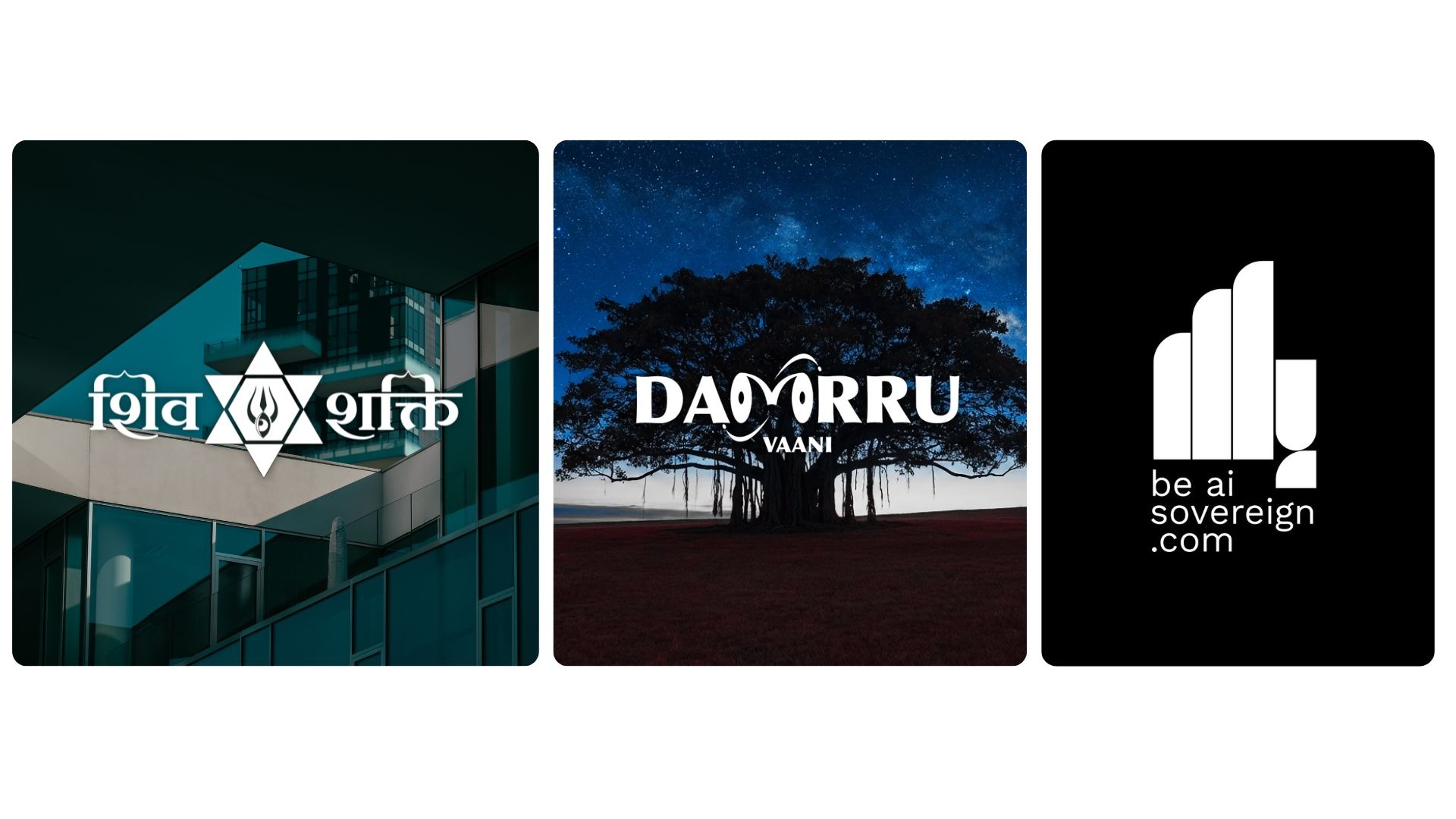
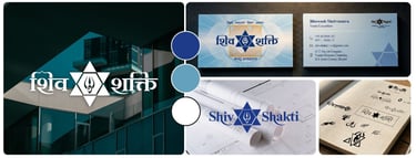
Case Study 1: ShivShakti Vaastu Consultancy
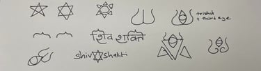
The Concept: A modern visual identity for a traditional Vaastu consultancy. The client required a mark that honored the dualistic energies of the universe without relying on the cluttered, overly complex artwork typically seen in this industry. The Execution: * Visual Geometry: The logo is anchored by the Shatkona (two intersecting triangles), a classical representation of masculine (upward) and feminine (downward) energies in Vaastu geometry.
Iconography: Nested within the strict linework of the hexagram is a synthesized, minimalist icon combining Shiva’s third eye and Shakti’s Trishul.
The System: The stark, fine-line logo was paired with a refined typographic system, a custom color palette, and elegant visiting card designs to project authority and structural harmony.

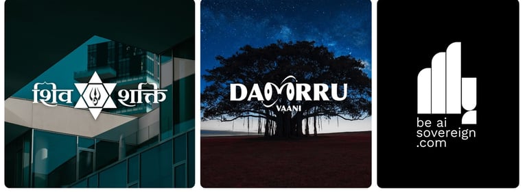
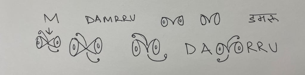
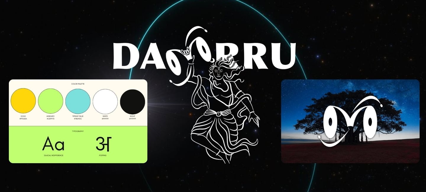
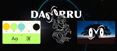
Case Study 2: Dammru Vaani
The Concept: An educational startup consulting on Vedic occult sciences, including Jyotish and gemology. The name is derived from the cosmic sound of Shiva’s damru (drum). The challenge was to create a brand that felt mystical yet highly approachable and academic. The Execution: * Typographic Customization: Instead of a standard icon, the brand is driven by a custom logotype. The double 'M' in "Dammru" was heavily modified into a continuous, flowing geometric shape that mirrors the physical form of a damru.
Visual Play: The stylized 'M' also acts as a subtle nod to the "eyes" of a seeker or an infinite loop, capturing the essence of occult study.
The System: Delivered a comprehensive visual suite including the central logo, color palette, primary and secondary fonts, and a series of promotional posters and ad creatives.
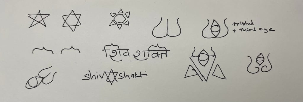
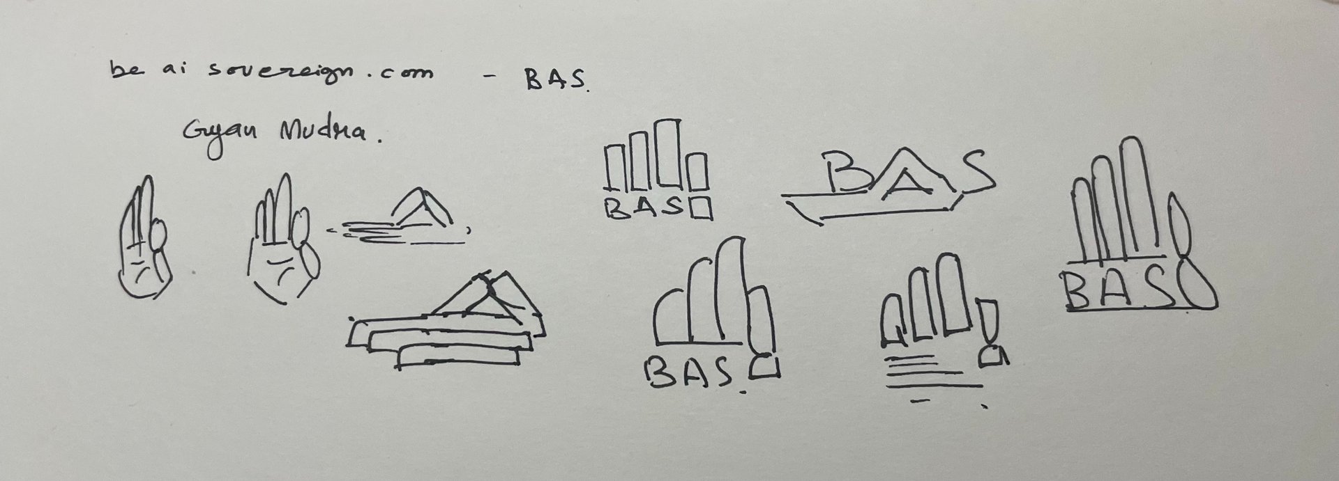
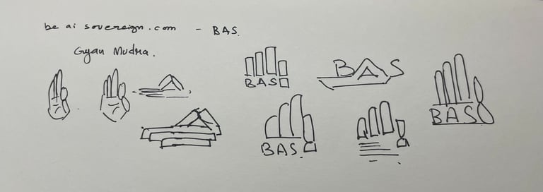
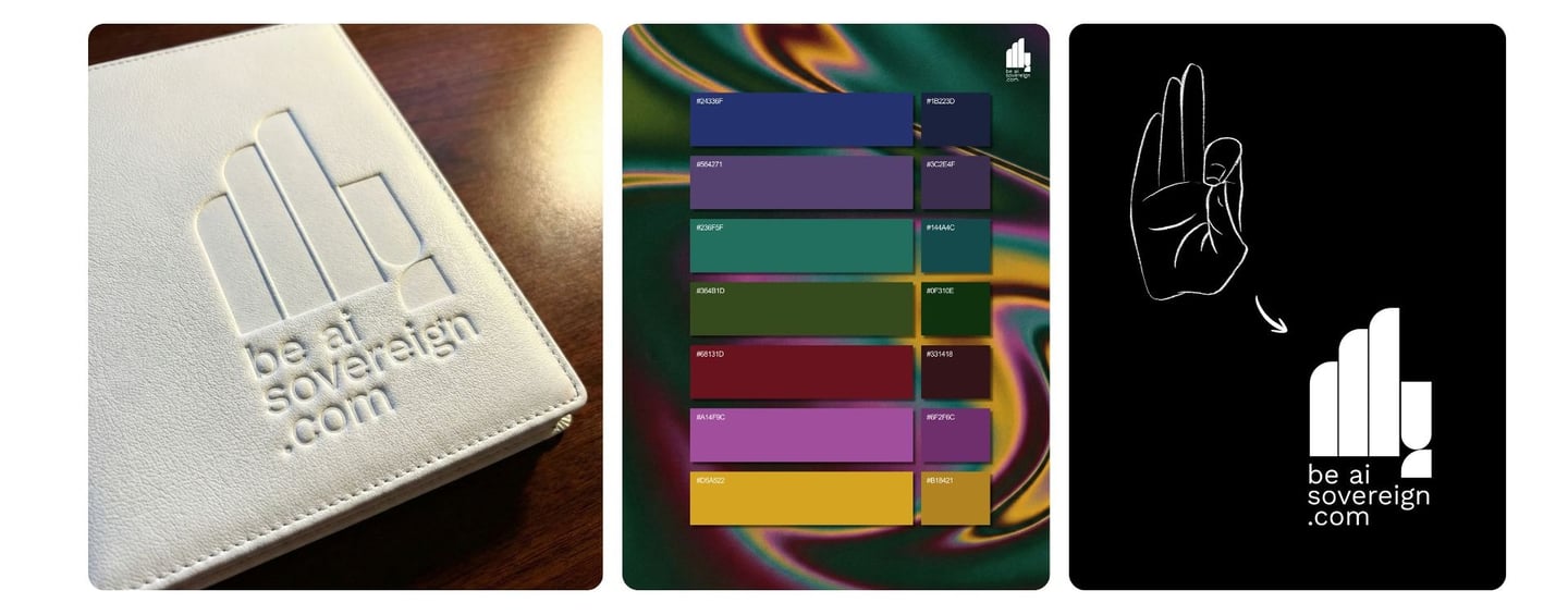
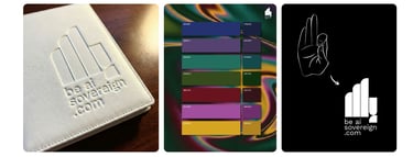
Case Study 3: be AI sovereign
The Concept: A tech-forward brand merging the philosophy of self-sovereignty with artificial intelligence. The client requested a visual representation of the Gyaan Mudra (the gesture of knowledge, where the index finger and thumb touch while the other three fingers stand straight). The Execution: * Abstract Minimalism: To prevent the brand from looking like a traditional yoga studio, the Gyaan Mudra was aggressively abstracted using brutalist, solid geometric shapes.
Form & Function: Thick vertical pillars represent the upright fingers, while the lower geometric curves create the closed loop of the thumb and index finger. The result is a bold, tech-friendly emblem that scales perfectly down to a favicon.
The System: Developed the primary brand mark, strict color palette, and clean, sans-serif typographic pairings for digital deployment.
Let's create something adbhut together.
Branding I Packaging I Illustration I Book covers I Concept art
Get in touch
© 2026. All rights reserved.
Follow me on:
Contact